Answer the question
In order to leave comments, you need to log in
Under what @media values to adapt the site design?
For example:
Основная версия от 960px
#Tablet (Portrait - Ipad)
@media only screen and (min-width: 768px) and (max-width: 959px) { }
#Mobile (Portrait)
@media only screen and (max-width: 767px) { }
#Mobile (Landscape)
@media only screen and (min-width: 480px) and (max-width: 767px) { }Answer the question
In order to leave comments, you need to log in
 Source
Viewport Sizes
UPD. From the presentation of Yandex about the adaptability of interfaces: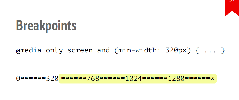
I'm one of the insane amount of questions already asked here about responsive width.
See how the designer intended. If it is always at 100% of the screen, then it already depends on the developer. I usually have enough to cut up to max 1920px. And so media queries can be different. If you allow a block of text is always 100%, inside the usual text, then what for media queries? You give it a width of 100% and it shrinks for you. If there are two blocks with text, then I set 50% each, at a width of 320-479 I simply removed the wrapping and aligned it in the center, that's all.
Here you need to look at the situation, but if you do not use bootstrap, then this is how it turns out:
320 - 479;
480 - 639;
640 - 767;
768 - 959;
960 - 1023;
1024 - 1279;
1280 - 1439;
1440 - 1599;
1600 - 1920;
And even then you may not need everything. Look at the situation.
Didn't find what you were looking for?
Ask your questionAsk a Question
731 491 924 answers to any question