Answer the question
In order to leave comments, you need to log in
The block is not fixed in chrome and opera on mobile phones. How to fix without absolute and fixed?
Good day.
I'm doing a chat on vue + vuetify. Layout problem.
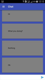
The bottom block with text input is displayed only when scrolling down in mobile chrome and opera. And to be more precise, when the panel with the input url leaves.
How to fix without position: absolute|fixed so that it is always visible at the bottom.
In firefox everything works as it should. Well, on the PC there are no problems at all.
Screenshots: 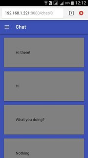
Code:
<template lang="html">
<v-app id="inspire">
  <Navbar />
   <v-content>
        <div class="cont">
            <div class="atem" ref="block">
                <Message
                    v-for="m in messages"
                    :key="m.id"
                    :name="m.name"
                    :text="m.text"
                    :owner="m.owner"
                />
            </div>

            <div class="btem">
                <MessageForm />
            </div>
      </div>
  </v-content>
</v-app>

</template>

<style lang="css" scoped>
.cont {
    position: absolute;
    width: 100%;
    height: 100%;
    display: flex;
    flex-direction: column;
    justify-content: space-between;
    overflow-y: hidden;
}
.atem {
    flex: 1;
    background: #3f51b5;
    position: relative;
    overflow-y: auto;
}
.btem {
    flex: none;
}
</style>Answer the question
In order to leave comments, you need to log in
Didn't find what you were looking for?
Ask your questionAsk a Question
731 491 924 answers to any question