Answer the question
In order to leave comments, you need to log in
The additional menu is not displayed correctly on the tablet and mobile?
Good afternoon! I am doing the layout using bootstrap 3. I need to make a menu - this menu is not the main (additional) one and should not be minimized on mobile devices. The sub-menu should remain as a list on the mobile device.
This is how the menu looks on a computer: 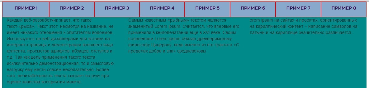
But when the browser window is reduced to the size of a tablet, the menu goes beyond the container (Fig. 1): 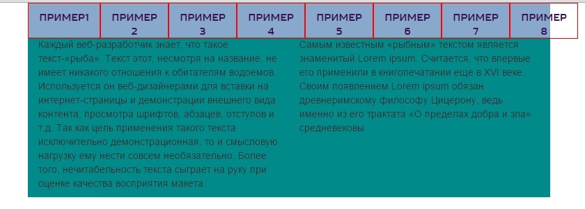
And when the browser window is reduced to the size of a mobile device, the text overlaps the menu (Fig. 2): 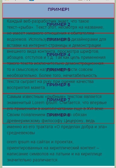
Here is the code :
<body>

<div class="container">

    <div class="row">

        <div class="primer">
            <ul class=" nav nav-justified">
                <li><a href="#">Пример1</a></li>
                <li><a href="#">Пример 2</a></li>
                <li><a href="#">Пример 3</a></li>
                <li><a href="#">Пример 4</a></li>
                <li><a href="#">Пример 5</a></li>
                <li><a href="#">Пример 6</a></li>
                <li><a href="#">Пример 7</a></li>
                <li><a href="#">Пример 8</a></li>
            </ul>
        </div>

   </div>
    <div class="row">

        <div class="col-md-4 col-sm-6 col-xs-12">
            <p>Каждый веб-разработчик знает, что такое текст-«рыба». Текст этот, несмотря на название, не имеет никакого отношения к обитателям водоемов. Используется он веб-дизайнерами для вставки на интернет-страницы и демонстрации внешнего вида контента, просмотра шрифтов, абзацев, отступов и т.д. Так как цель применения такого текста исключительно демонстрационная, то и смысловую нагрузку ему нести совсем необязательно. Более того, нечитабельность текста сыграет на руку при оценке качества восприятия макета.</p>
        </div>

        <div class="col-md-4 col-sm-6 col-xs-12">
        <p>Самым известным «рыбным» текстом является знаменитый Lorem ipsum. Считается, что впервые его применили в книгопечатании еще в XVI веке. Своим появлением Lorem ipsum обязан древнеримскому философу Цицерону, ведь именно из его трактата «О пределах добра и зла» средневековы</p>
        </div>

        <div class="col-md-4 hidden-sm col-xs-12">
            <p>orem ipsum на сайтах и проектах, ориентированных на кириллический контент – написание символов на латыни и на кириллице значительно различается.</p>
        </div>

    </div>


</div>
</body>.container{background: #008B8B;}
.primer {
background: #88a9cc;
height: 50px;
}
.primer ul li {
border: solid 1px red;
text-align: center;
height: 50px;
}
.primer ul li a{
padding-top: 30px;
font-family: 'Russo Sans';
color:#3A1057;
font-size: 14px;
padding-bottom: 0px;
}Answer the question
In order to leave comments, you need to log in
Didn't find what you were looking for?
Ask your questionAsk a Question
731 491 924 answers to any question