S
S
saltsamuraii2020-10-02 01:35:18
Frontend
saltsamuraii, 2020-10-02 01:35:18

Test task for Junior Frontend, isn't it a scam?

Good night, I am writing here for the first time, I responded to this vacancy in one web studio, they sent a response with a telegram bot which contains a test task.
TK tasks


При сдаче верстки на проверку должно быть все готово: деск, моб версия макетов + ссылка на эту верстку

1. Макет, все его детали, отступы, шрифты и стили шрифтов должны быть 1 к 1 соблюдены в верстке. Если с этим возникают проблемы - используем Pixel perfect
2. Использовать БЭМ )(https://ru.bem.info/methodology/naming-convention/
3. По умолчанию основное разрешение - 1920px.
4. Адаптивные версии под разрешения менее 1920px должны максимально сохранять пропорции в процентном соотношении как показано в макете. Обязательная проверка на MAC OS
5. Тексты не должны дублироваться в коде, верстаем адаптивно. По возможности то же самое касается остальных элементов.
6. Мобильная версия должна подключаться при разрешении менее 767px.
7. Скрипты должны работать во всех браузерах (Chrome,Mozilla,Safari,Microsoft Edge)
8. Заголовки h1–h6 не должны использоваться как элементы дизайна или вёрстки и использоваться в текстовой части страницы. У заголовков должны быть прописаны стили в файле стилей (CSS)
9. Картинки должны содержать атрибут alt=””.
10. Уместное использование айдишников (только для скриптов и якорей)
11. По возможности избегать position:absolute
12. Блоки по возможности делать так чтобы их можно было спокойно вытащить из родительского блока (не было жесткой привязки к родителю)
13. Картинки которые будут подгружаться из базы данных сайта - не должны быть прописаны в файле css. Сохранять картинки в максимальном качестве. Все картинки выводить с помощью тега img.
14. Формы для заявок должны быть сверстаны предельно просто, как образец - Контакты | Сезон MACARONS.
15. Повторяющиеся блоки (например - каталог товаров, список новостей итп.) не должны отличаться между собой в коде.
16. Тег "br" не используем вообще.Нельзя теги выделения (strong, u, i) делать вложенными. Например, "strong""i"текст"i""strong".
17. Используйте только один из тегов выделения. (примечание: тег "b" устарел, используем только ).
18. Если согласно дизайну названия должны быть капслоком - только через css.
19. Оборачивать кнопки (кроме форм) в ссылки и логотип сайта тоже
20. Для карт использовать яндекс карты
21. Слайдер swiper
22. Если можно обойтись без прописывания стилей, лучше обойтись.

Результат заливаете на хост, скидывать нам ссылку для просмотра. Основная + мобильная версия в полном объеме готовности. Мольная версия в приоритете


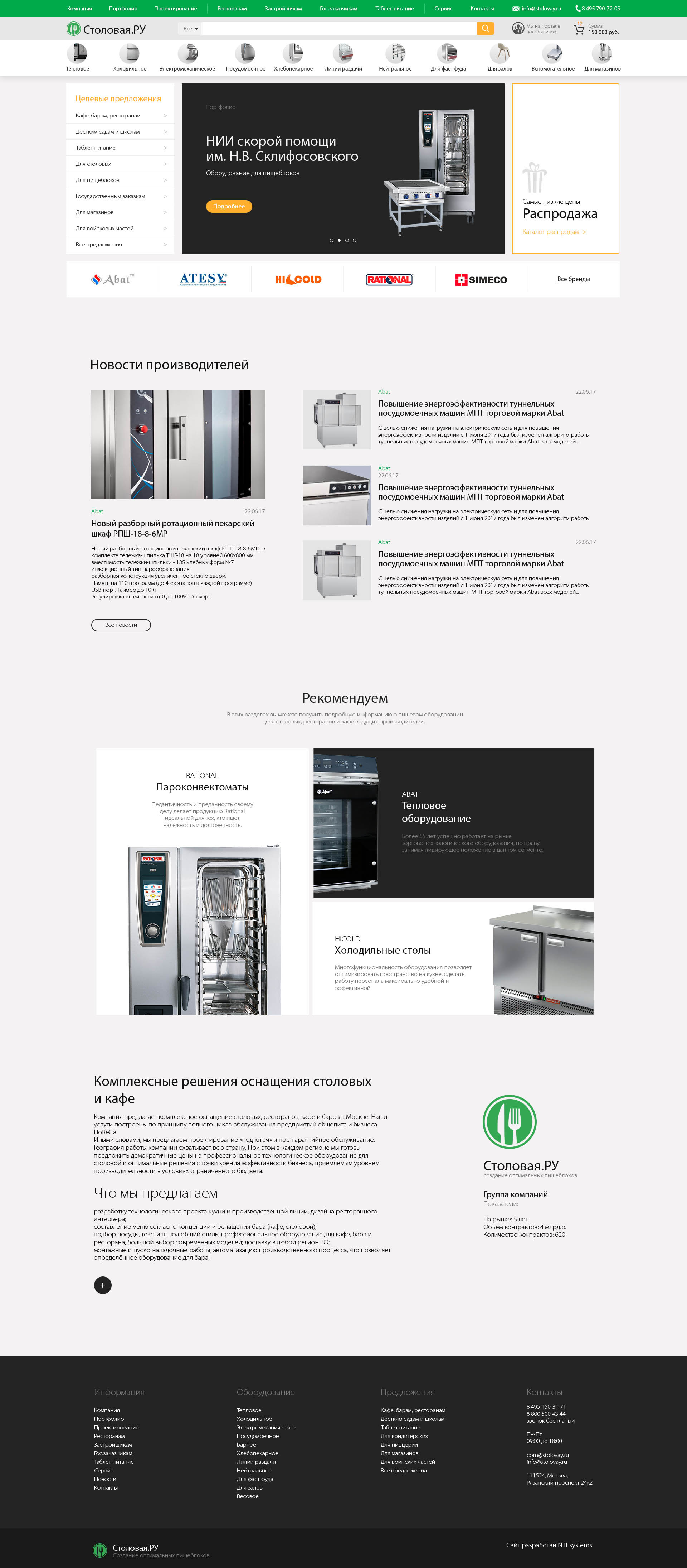
And page photo
5f7658fff0e46605067008.jpeg


I apologize in advance for the question, since this topic has been raised so many times, since I am new to looking for a job in the IT field, I would like some advice. And I apologize for the long text.

Answer the question

In order to leave comments, you need to log in

7 answer(s)
V
Vitaly Pershin, 2020-10-02
@saltsamuraii

You just need to drive the name into the search) Your work is already in production , most likely your studio made this site and took the design for a test task, I have already encountered such a practice, so you can safely typeset and peep at the original ..
The task is far from juna, in order to appreciate you enough caps with a menu, but they want to squeeze the maximum out of you

17. Use only one of the highlight tags. (note: the "b" tag is deprecated, we only use ).

This is nonsense, the strong and b tags have different tasks. strong is a semantic tag, and b is needed to highlight the text, but not make it an accent for robots..

I
Ivan, 2020-10-02
@piccca

There is only one way to trust and do. Even if they throw it, there will be a portfolio

E
Evgeniy Skorobogatov, 2020-10-02
@NetSky

The TK is, in principle, competent ... but ... not for a test task, but for a combat one .. a test task is given in order to understand what a junior is capable of.
So either wiring .. or a barrier .. Well, you can do it, why not, experience is a useful thing

K
Kirill Gorelov, 2020-10-02
@Kirill-Gorelov

By the way, you can insure yourself.
Arrange for payment. It is quite a normal practice, even if you are not hired, then at least you will earn something.
After all, this is a test task, also work.
When we were looking for a layout designer, we also gave him a test task and agreed on a symbolic payment. And both sides reacted well to this.
This can only be used as a life hack. Because as they wrote above, this is the design of a ready-made site. That is, they really want to check you, and not save money ....

G
Glory, 2020-10-02
@besogonskiy

You should not work with these people. They are not decent times asking a person who has fallen into a difficult situation to do such a voluminous job. It's as if a personnel officer offered a young beautiful girl to give him a minuet in exchange for being accepted for a good job.
They had to at least offer money for this work if the work would meet the quality level.

A
approximate solution, 2020-10-02
@approximate_solution

I think it's a good job.
Firstly, even if your potential employer scams you, nothing prevents you from putting the page you made up in your portfolio.
Secondly, the speed of layout and development is the employer's money. The faster the order goes into production, the faster the employer will take a new one and get the cash, and you, therefore, if the rate is a percentage of the order.
Therefore, if such a page seems complicated or voluminous for you, this is bad. Since the layout is structurally quite light, you can use flex and grid, no complicated graphics.
The only thing that confuses, or I didn’t read the mb to the end - did they send you a photo with a page with a request to make it up, or layouts in figma for desktop, tablet, and mobile?

P
Programmir, 2020-10-03
@Programmir

Well, if you are ready to work for free, then you can spend your time on it.

Didn't find what you were looking for?

Ask your question

Ask a Question

731 491 924 answers to any question