Answer the question
In order to leave comments, you need to log in
Strange font rendering in IE9 beta
Along the way, while working on my project , I encountered a strange “rendering” of fonts in Internet Explorer 9.
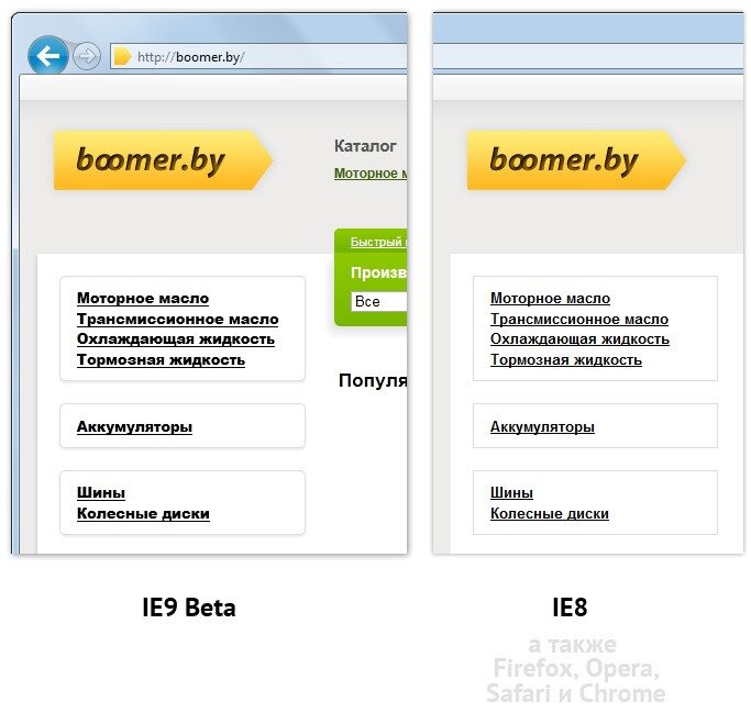
The shadow fell on the browser’s work, so in other Internet browsers, be it Chrome, Opera, or even the eighth Internet Explorer, everything looks great. Here, clearly in comparison:
Moreover, upon detailed examination of the problem, it turned out that IE9 beta , in addition, arbitrarily compressed the font in width.

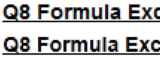
We also see that the anti-aliasing filter itself began to work a little differently when compared with previous versions of the browser.
And now, actually, to the question then :-)
Yes, it is clear that this is a beta, there is a chance that it will still get better, get better, but you never know .
Yes, simultaneously with the publication of this note, I am trying to send a bug (?) to the microsoft support (the same quest, with the constant installation of additional plugins, it is not clear why , without which you won’t send a message to support).
And yet ... If someone has already encountered a similar problem and, all of a sudden , knows its solution - do not share the answer?
And even if you know that there is no solution, then this will also be a great help :-)
Answer the question
In order to leave comments, you need to log in
This is how hardware acceleration works through DirectWrite and the font rasterizer in WPF. There is no way to influence it, it will always give other metrics than GDI, due to the fact that different anti-aliasing and hinting methods are used. The only solution is to adapt, to make the layout “more rubbery”, without being tied to font metrics (more precisely, line lengths).
PS Also the site itself will look in Firefox 4 with DirectWrite acceleration enabled.
It is curious that in terms of font rendering in the menu in IE9, it became painfully similar to Arial Black, although it is not used anywhere on the site (everywhere the standard Arial).
If the new anti-aliasing filter modifies it this way, then it is very strange. Just blurring and bold should not give such a radical effect.
Well, the X-UA-Compatible tag solves this problem, although this is not entirely fair in relation to IE9
Something doesn't fit with you.
In the first case, the letters became bolder and wider, while in the second they became thinner.
More like two different bugs - in the first case, Arial Black instead of Arial, in the second case - a different anti-aliasing.
And I turned off hardware acceleration in FF because of this WPF - anti-aliasing.
Didn't find what you were looking for?
Ask your questionAsk a Question
731 491 924 answers to any question