Answer the question
In order to leave comments, you need to log in
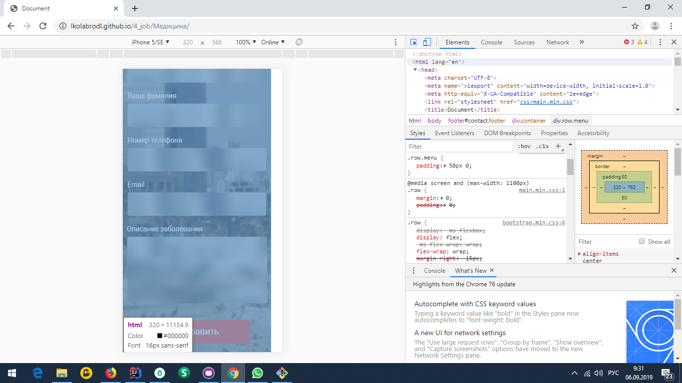
Responsive layout and a white stripe on the right, I tried everything. What's wrong?
Hello, if you can help me I will be immensely grateful.
site:
https://lkolabrodl.github.io/4_job/%D0%9C%D0%B5%D0...
white bar on the left when viewed from a mobile device. firebug does not show this bar, but it is on mobile and is displayed in chrome
did on the bootstrap grid. 
1)viewport is set,
2) indents from containers are removed,
3) body{width:100%; height:100%; overflow-x:hidden;}
4) I don't have a content class
thanks for your attention
Answer the question
In order to leave comments, you need to log in
1. In the image responsive, use img{ width:auto; max-width:100%; }
2. To see who climbs where, write *{ border:1px solid red; box-sizing:border-box; }
3. Work on the footer more))
4. Often the culprits of such breakdowns are the arrows from the slick-slider, which happened in your case. Point them to the right position (now they have crawled out of the container)
5. You can also remove the box-shadow in the reviews
Didn't find what you were looking for?
Ask your questionAsk a Question
731 491 924 answers to any question