Answer the question
In order to leave comments, you need to log in
Rate the layout (Constructive criticism)?
Hello!
Please rate the layout. If there are errors, write the correct way.
Link
Answer the question
In order to leave comments, you need to log in
in the header you can’t see where you point the
buttons a large indent from the bottom
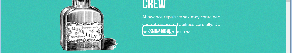
Structurally: the lack of adaptability is no longer good (because what you have written in the head does not work). In addition, purely visually, look at all the buttons, the text is not centered, it sticks to the top. The slider probably doesn't: outline: none;

1. Make the logo a link to the main page
2. Add indents so that the text does not overlap the search icon
3. In the menu, specify padding not for li, but for links (make them block ones), in this case it will be easier to click on links and the style will be nice.
Also you have an error loading some font.
Didn't go lower
The first thing that caught my eye (the speed of the Internet is not the fastest) is the background in the form of a Layer-0 image, which took a long time to load (very noticeable to the eye). The picture is 161kb in size and at the same time pixelated. Instead of it freely, you can use for example this (11kb):
Didn't find what you were looking for?
Ask your questionAsk a Question
731 491 924 answers to any question