Answer the question
In order to leave comments, you need to log in
PDF spoils the quality of the logo. How to be?
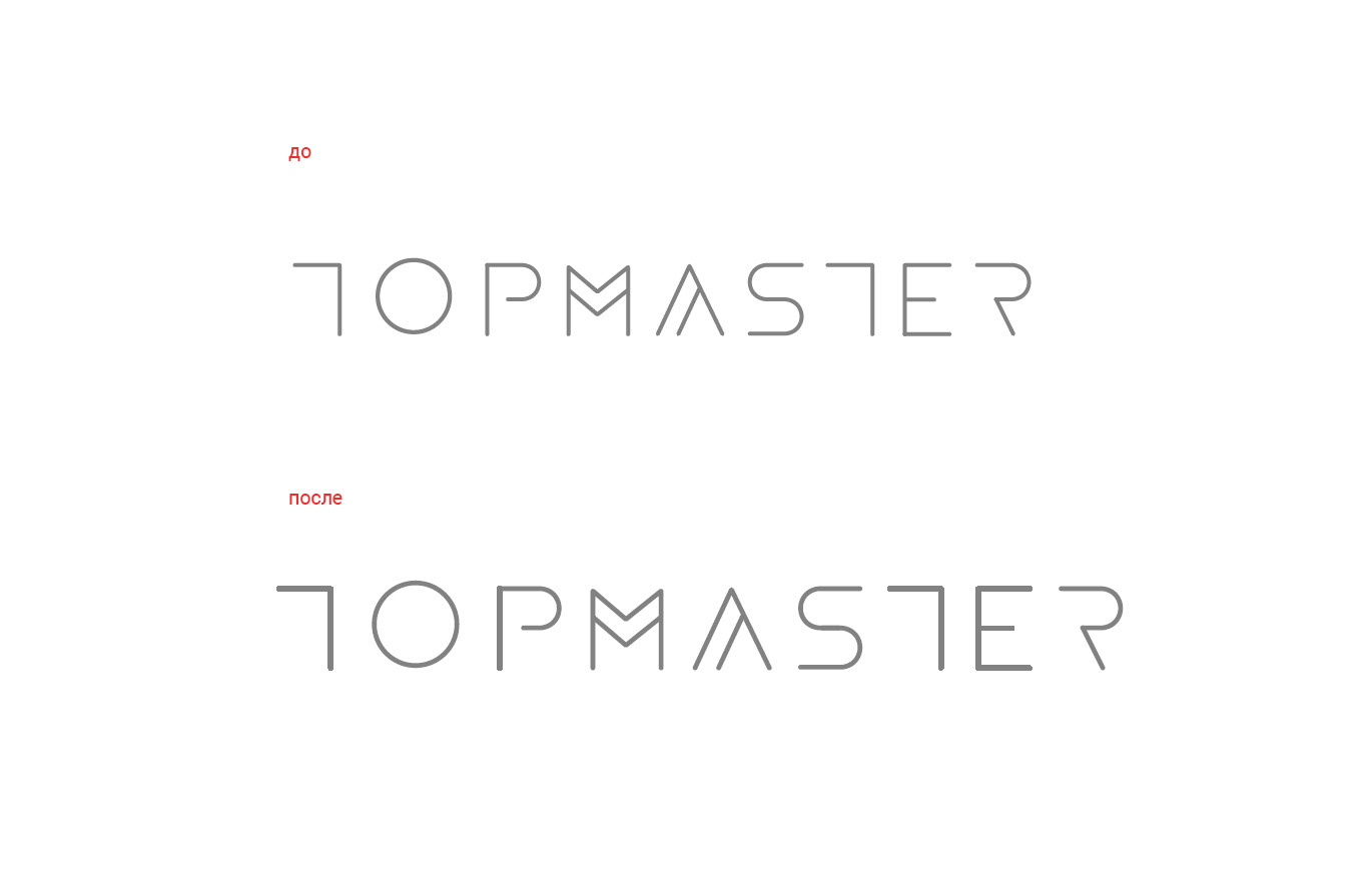
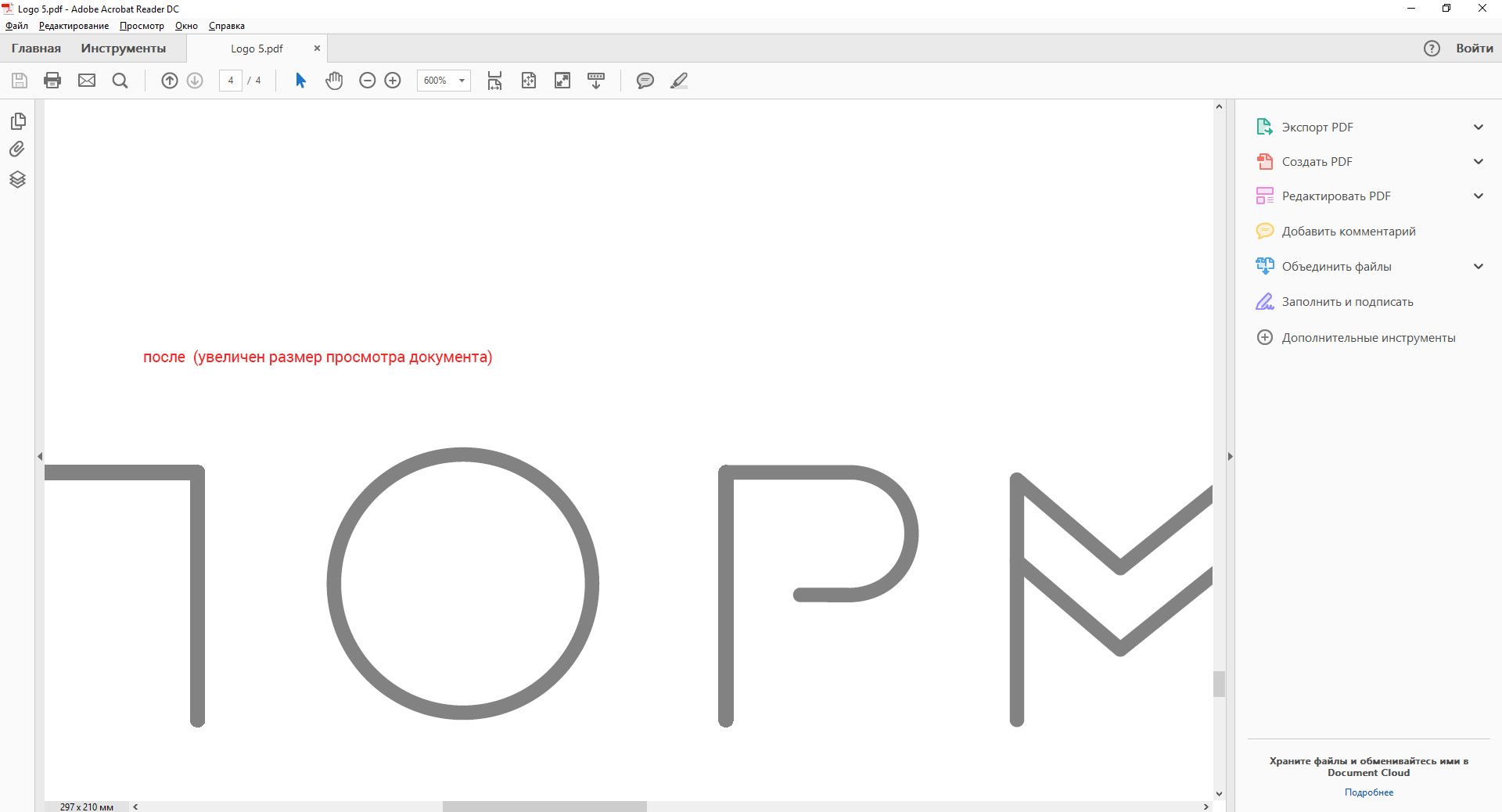
When saving to pdf, the logo changes the thickness of some lines. Looks terrible. The font was drawn with curves making a stroke with a further expand appearance. It's not the first time I've noticed this. But if you increase the view by a very large value, the lines are aligned. In this case, you need to write instructions that the logo will be displayed normally only at 10x magnification. It's not an option.

Answer the question
In order to leave comments, you need to log in
wait, is it just lines or is there a stroke?
Did you delete the extra objects after the epirience expansion?
take next to draw just two lines. one regular line with a thickness of, say, 2pt, and the second one with a stroke, and expand it. what will show in pdf?
also look in an alternative viewer, such as Foxit. So you will find out whose problem is - maybe you have a ~ "hairline" thickness there and the acrobat VIEWER displays it like that on the output.
Didn't find what you were looking for?
Ask your questionAsk a Question
731 491 924 answers to any question