Answer the question
In order to leave comments, you need to log in
Need design advice?
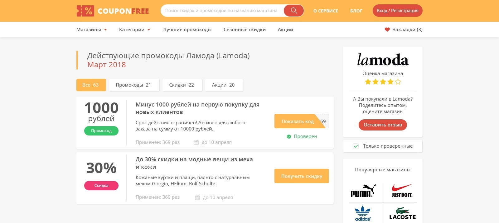
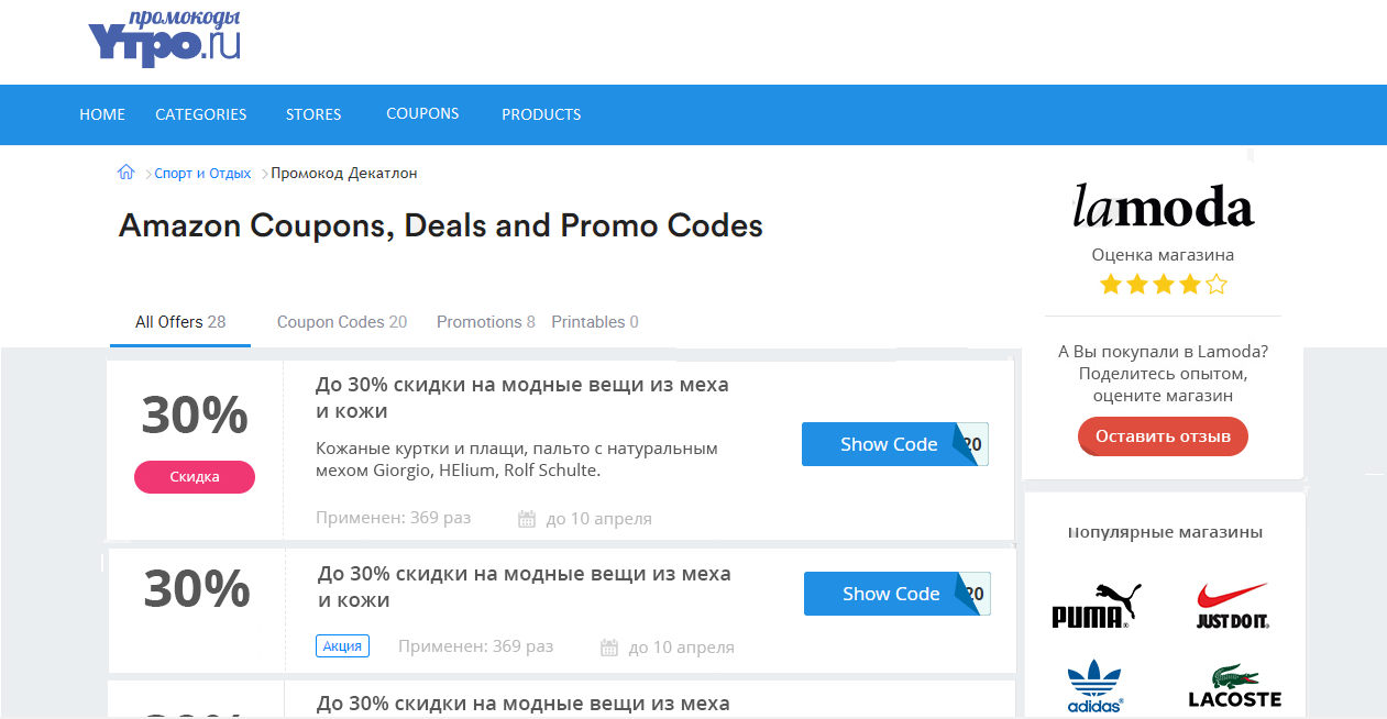
I am creating a site for promotional codes, now at the stage of designing the page that will be visited the most - the store's promotional codes page. But there is some uncertainty, the uncertainty of what color, for example, to put, where to place the blocks, or what background. For example, it seems to me that orange rushes very strongly, and it will be more difficult to read, but maybe I'm wrong. Advise what to change or add to the design. Or is the second option better? Thanks

Answer the question
In order to leave comments, you need to log in
It's just that the shade of orange is chosen unsuccessfully, white text is hard to see on it. Possible solutions - add a shadow or make the orange not so pale:
If you can not achieve more expressiveness in these ways, it is better to leave the blue.
I would also remove the background from the header, it's very distracting:
Secondary red buttons also distract attention to themselves. They stand out more than the main ones. I would fix it somehow like this:
If we move further towards getting rid of distracting elements:
Optionally, you can additionally focus on the size of the bonus with color in several ways:
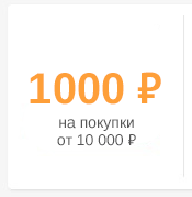
Thought more and gave birth to a few more good ideas. You can completely get rid of the words "promo code" and "discount", this will be clearly indicated by the symbols ₽ and %. I was finally convinced that the orange background would be superfluous, and the orange symbols are quite ok. You also need to briefly describe the conditions for providing bonuses, if possible, and format large numbers (for example, 10,000 ₽ - thousands are separated by a space, I'm not sure about 1 thousand):
Use color palettes, don't point your finger at the sky.
Manual selection
Pre-made palettes
Didn't find what you were looking for?
Ask your questionAsk a Question
731 491 924 answers to any question