Answer the question
In order to leave comments, you need to log in
Layout for mobile devices. What am I doing wrong?
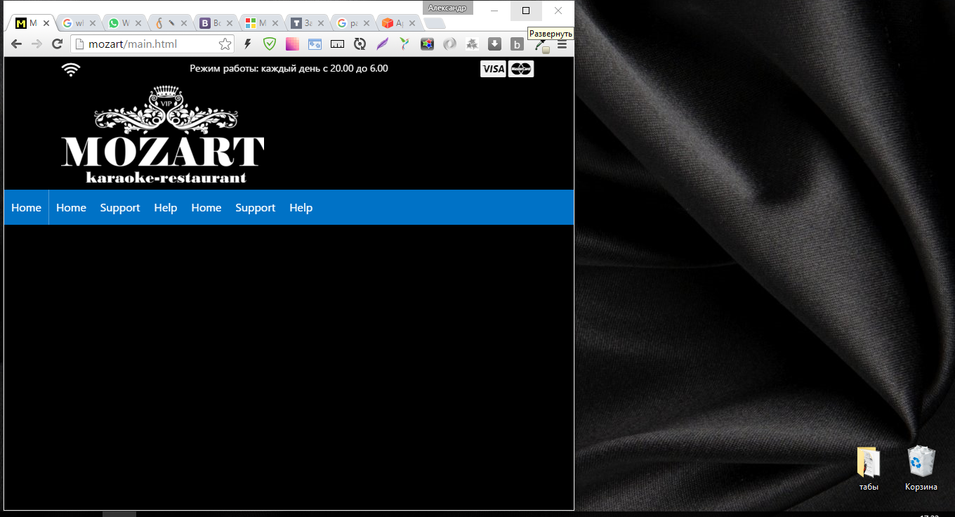
Started making up the page. This is how it is displayed when the browser is opened to full screen (1366 by 768): 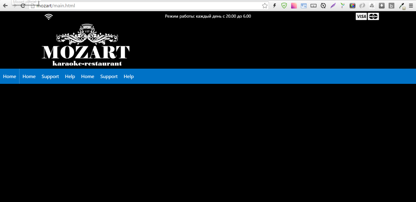
Here, for the topmost block, a grid is used, three columns - the Wi-Fi icon, operating mode and payment cards. When compressing the browser, everything works as it should:
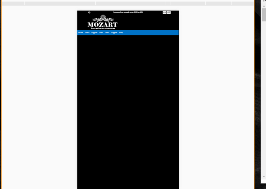
As you can see, they are compressed, everything is fine, the columns work. I launch a view from mobile devices in the developer tools (for example, with a screen size like that of an iPhone-6)
The page is not responsive, as if I fixed its width.
What could be the problem?
Answer the question
In order to leave comments, you need to log in
Didn't find what you were looking for?
Ask your questionAsk a Question
731 491 924 answers to any question