Answer the question
In order to leave comments, you need to log in
Is this really possible to make?
Good afternoon, dear layout experts! I'm sending an SOS signal into space Please help me implement such a super-rubber-centered layout.
For several days I have been trying to make the divs inside the parent be centered, stretched in height and width, have indented edges and some blocks are pressed against the edges of the parent.
I tried to implement it through display:flex, display:table(table-row), but not everything works according to the screenshot. Help please, beer is guaranteed from me! Case of beer! :)
Thank you very much!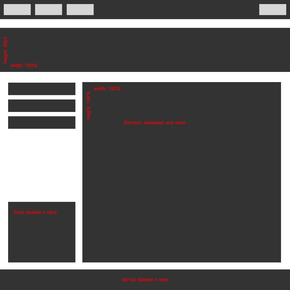
Answer the question
In order to leave comments, you need to log in
Markup:
<div class="container">
  <div class="container-block panel -gray">
    <div class="panel-element -light-gray"></div>
    <div class="panel-element -light-gray"></div>
    <div class="panel-element -light-gray"></div>
    <div class="panel-element -light-gray"></div>
  </div>
  <div class="container-block promo -gray"></div>
  <div class="container-block content">
    <div class="aside">
      <div class="menu">
        <div class="menu-item -gray"></div>
        <div class="menu-item -gray"></div>
        <div class="menu-item -gray"></div>
      </div>
      <div class="banner -gray"></div>
    </div>
    <div class="main -gray"></div>
  </div>
  <div class="container-block panel -gray"></div>
</div>* {
box-sizing: border-box;
}
body {
margin: 0;
}
.-gray {
background-color: #333;
}
.-light-gray {
background-color: #d6d6d6;
}
.container {
display: flex;
flex-direction: column;
justify-content: space-between;
align-items: stretch;
min-height: 100vh;
}
.container-block + .container-block {
margin-top: 30px;
}
.panel {
display: flex;
flex-wrap: nowrap;
justify-content: flex-start;
padding: 10px;
height: 50px;
}
.panel::after {
content: '';
flex: 1;
}
.panel-element {
width: 75px;
height: 30px;
}
.panel-element + .panel-element {
margin-left: 10px;
}
.panel-element:last-child {
order: 1;
}
.promo {
height: 120px;
}
.content {
flex: 1;
display: flex;
justify-content: space-between;
align-items: stretch;
padding-left: 30px;
padding-right: 30px;
}
.aside {
display: flex;
flex-direction: column;
justify-content: space-between;
width: 200px;
margin-right: 30px;
}
.main {
flex: 1;
}
.menu-item {
height: 40px;
}
.menu-item + .menu-item {
margin-top: 15px;
}
.banner {
margin-top: 30px;
height: 150px;
}Didn't find what you were looking for?
Ask your questionAsk a Question
731 491 924 answers to any question