Answer the question
In order to leave comments, you need to log in
Is text indentation in FIGMA designed that way?
There are two questions for those who know figma.
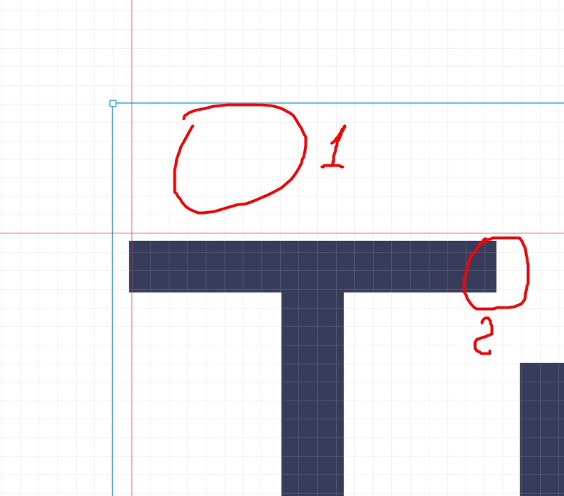
1) Is it normal for text to have "invisible padding" on all sides?
How can this be removed?
2) And the fact that the pixel is not a whole also looms normal?

Answer the question
In order to leave comments, you need to log in
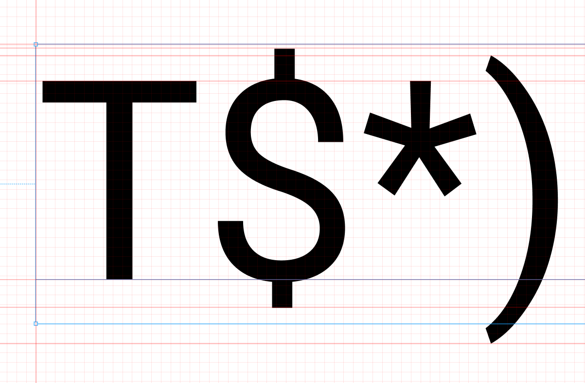
I haven't worked in figma before, but now I opened it out of curiosity. This, of course, is crap that such an indentation, but I can assume that this is done because of the different character heights. The dollar sign is higher than the letter "T"

True, the brackets from below go abroad ...
in short, thanks, you discouraged the desire to study Figma
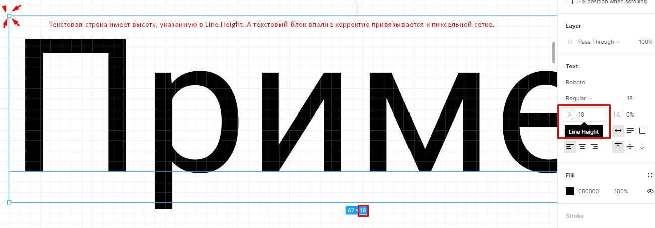
Line height - Line Height - this is the height of your frame for this text.
The text block also snaps correctly in the pixel grid.
This is how text behaves, at least on the web.

Didn't find what you were looking for?
Ask your questionAsk a Question
731 491 924 answers to any question