Answer the question
In order to leave comments, you need to log in
Is such a generic media query good?
Based on the data from the site mydevice.io/devices , I developed my own four gradations of screen sizes:
"смартфоны_верт" - (min-width: 320px) and (max-width: 599px)
"смартфоны_гориз" - (min-width: 480px) and (max-width: 799px)

"планшеты_верт" - (min-width: 600px) and (max-width: 1024px)
"планшеты_гориз" - (min-width: 800px) and (max-width: 1440px)

"мониторы_верт" - (min-width: 1025px)
"мониторы_гориз" - (min-width: 1441px)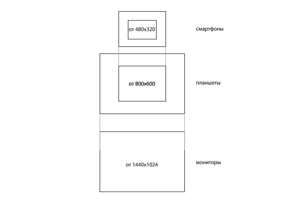
Answer the question
In order to leave comments, you need to log in
deprecated this is enough:
<meta name="viewport" content="width=device-width" />As much as possible about media...
320+ - phones
768+ - tablets in portrait
1024+ - tablets in landscape, computers
Intermediate - very specific.
More than 1024 - only if the design is adaptive for larger sizes. Usually there are 1200+, but it is not always found.
Do not confuse the physical screen resolution and how it is perceived by css.
Read https://github.com/andrey-hohlov/psd-templates-req... there is about retina.
Didn't find what you were looking for?
Ask your questionAsk a Question
731 491 924 answers to any question