Answer the question
In order to leave comments, you need to log in
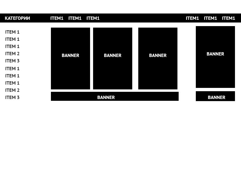
How would you make this block?

Good day The
layout should be adaptive
here is the actual code codepen.io/yespeace/pen/LpWNmM
I don't like that I have to put the list with categories in position absolute
Even with this layout I will have a lot of fiddling with media quierry for other resolutions.
Well, in principle, there was another option, to make banners under position absolute, because anyway they are not needed on mobile phones, right?
Answer the question
In order to leave comments, you need to log in
What are you talking about? There is absolutely no need for position. You have two blocks - the title and the body. Each of them is divided into 3 parts:
- heading: categories, item group 1, item group 2
- main part: item group 3, banner group 1 and banner group 2.
All you have to do is set the same percentage width or vh:
1. categories and group of items3, for example width: 20%;
2. item group 1 and banner group 1, for example width: 60%;
3. item group 2 and banner group 2, for example width: 20%;
I doubt that using display: flex will require media queries at all.
Didn't find what you were looking for?
Ask your questionAsk a Question
731 491 924 answers to any question