Answer the question
In order to leave comments, you need to log in
How to use StoryBoard correctly?
Essence:
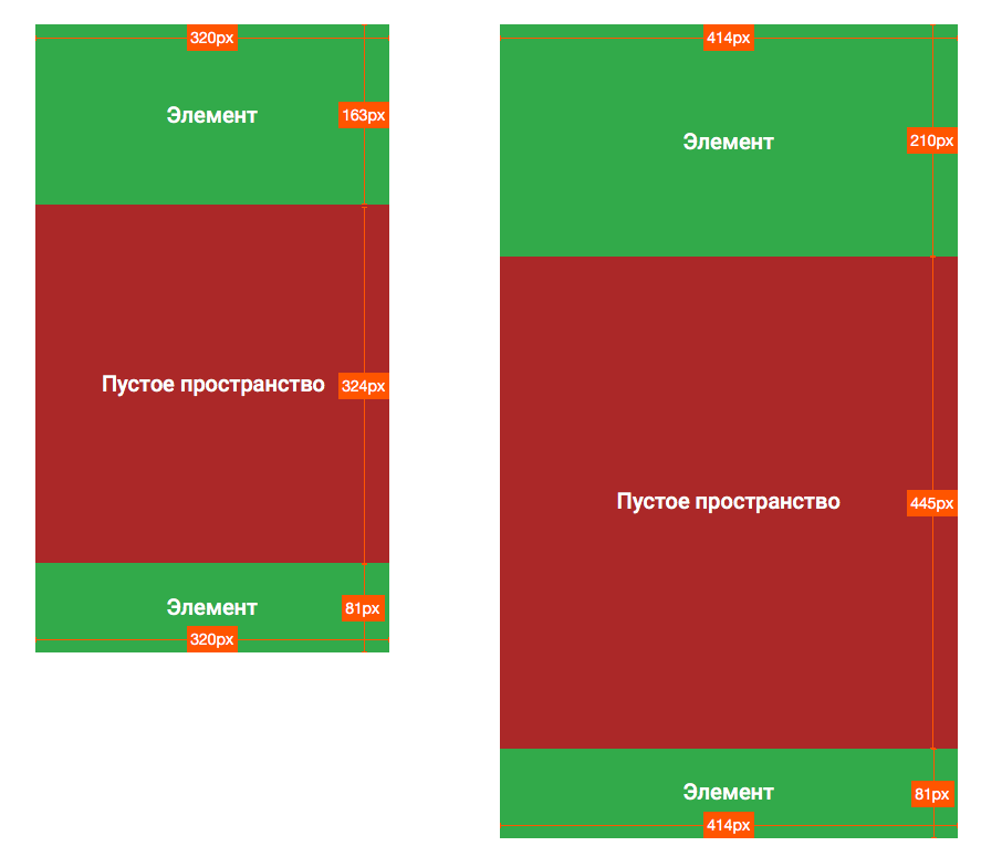
I attach a picture, it clearly shows what needs to be done. But how to do it, I use storyboard in xcode - I don’t understand. It seems like I figured it out, built the interface, but if it looks good on the iphone 6-plus, then on the iphone 4s it looks disgusting (the elements climbed on top of each other, some are too small, the indents of the elements from each other are too large, etc.). On the contrary (if I do it under 4s) - the same trouble on 6-plus (and not so hot on 5).
In principle, a separate storyboard for each screen solves the problem, but adds a bunch of other problems (translation, changes).
Constraints naturally I arrange everything, on various modes I correct everything (ANYxANY and so on).
What to do with this trouble - I'll never know, under android it was somehow easier.
Answer the question
In order to leave comments, you need to log in
If you need a pixel perfect, then do it in code. Otherwise, you can size elements in % of the sizes of the parent and other elements.
If I understood correctly, then you want to position the elements proportionally.
iOS 9+ Layout-guides
before 9, this was done using transparent views between the main views, and the corresponding values were set in IB.
Thank you all very much for your replies.
Here is the link , for those who will ask the same question.
Didn't find what you were looking for?
Ask your questionAsk a Question
731 491 924 answers to any question