Answer the question
In order to leave comments, you need to log in
How to smartly resize a photo for different screen resolutions and proportions (desktop, smartphone)?
Original photo size: max 1600x500 If the photo is larger, then I cropping and resizing
to
1600x500 using the Intervention Image library image.intervention.io/api/fit
etc ).
In addition to the desktop version, there is an adaptive version for mobile devices. And of course, in the adaptive, the image scales incomprehensibly, and the visitor sees an incomprehensible piece in the header.
How would you solve the problem of adapting photos to different devices and proportions? Can this be done automatically?
So far, the only option that came to my mind is when we upload 2 photos: for the desktop and the version cropped by a person for mobile.
How it looks on devices:
Desktop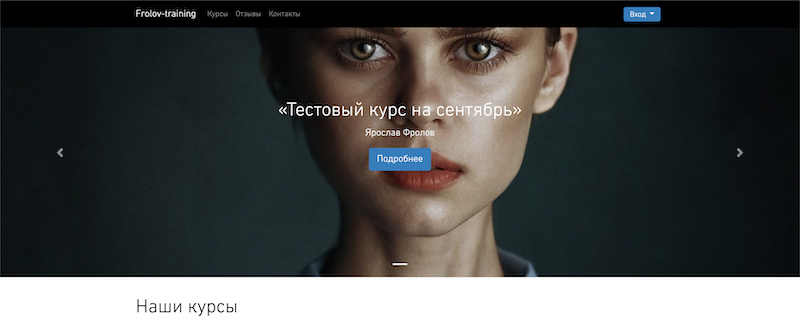
iPad 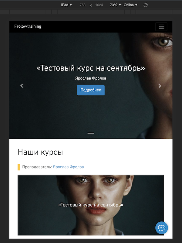
iPhone
Answer the question
In order to leave comments, you need to log in
<picture>
  <source media="(max-width: 799px)" srcset="elva-480w-close-portrait.jpg">
  <source media="(min-width: 800px)" srcset="elva-800w.jpg">
  <img src="elva-800w.jpg" alt="Chris standing up holding his daughter Elva">
</picture>You've come up with exactly the right idea.
In general, in each situation, you need to build on what should be the result. If we are talking about the visual component, then you need to look at it, adjust it, etc.
Automatically, you can only set object-fitand object-position, but with these parameters and sizes (width, height) of the image, you can then "play" through media queries, adjusting to the desired option.
Didn't find what you were looking for?
Ask your questionAsk a Question
731 491 924 answers to any question