Answer the question
In order to leave comments, you need to log in
How to sharpen text in Photoshop?
Tell me, please, here in Photoshop you can set the sharpness for the text ... In what cases, which style is better to use?
*probably a noob question, but I'm far from the style .. and I don't really understand in which case what sharpness is better to use .. maybe there are some rules?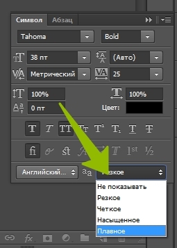
Answer the question
In order to leave comments, you need to log in
Which one looks better, put that one.
The only thing is that for pixel art it is better not to turn on sharpness at all.
You seem to have an older version of Photoshop.
In recent versions, there is a setting (I call it macOS X) that makes it look like in a browser on a monitor.
In 99% of cases, Sharp (the second item on the list, i.e. "sharp"), but forget about the others altogether. Until you know what the difference is and you don’t need to apply this knowledge in your work, you should use only this option, which everyone has by default.
PS But the language setting (to the left of the dropdown) can sometimes be more useful for a non-designer. What language the text is in, put it there.
And it is better to use the English version. It will be clearer to read the advice of others or lessons on the Internet, and you will improve your knowledge of the terms. Sometimes you cry from trying to understand what a person with Russian-speaking Fsh, Ai, etc. means.
Didn't find what you were looking for?
Ask your questionAsk a Question
731 491 924 answers to any question