Answer the question
In order to leave comments, you need to log in
How to set up CSS media queries correctly?
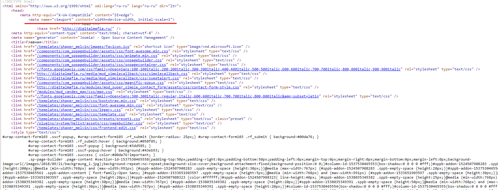
Site running joomla 3. In the head tag I wrote:
<meta name="viewport" content="width=device-width, initial-scale=1">@media (min-width: 992px) and (max-width: 1360px) {
#sppb-addon-1538044483154 .sppb-addon-title {
font-size: 20px;
}
#sppb-addon-1538051252651 .sppb-addon-title {
font-size: 20px;
}
#sppb-addon-1538051252656 .sppb-addon-title {
font-size: 20px;
}
}

Answer the question
In order to leave comments, you need to log in
<meta name="viewport" content="width=device-width, initial-scale=1, maximum-scale=1">media screen and (max-width: 1200px) {
.container {
width: 970px;
}
}
media screen and (max-width: 991px) {
.container {
width: 750px;
}
}
media screen and (max-width: 767px) {
.container {
width: 450px;
}
}
media screen and (max-width: 479px) {
.container {
width: 310px;
}
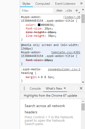
}Most likely, the styles from the temaplate.css file are included before those that overlap. Here, either increase the weight of the selector, or change the sequence of connecting styles.
The rule is overridden by a higher priority selector
Didn't find what you were looking for?
Ask your questionAsk a Question
731 491 924 answers to any question