Answer the question
In order to leave comments, you need to log in
How to responsively place divs (three in a row, and for the mobile version centered one below the other)?
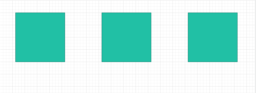
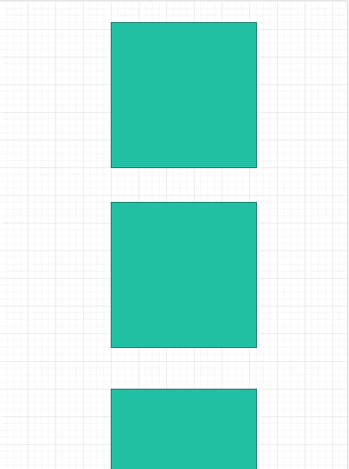
For desktops, the location of blocks that contain 280x300 images should be placed three in a row  , and when the screen is reduced, the blocks should be located one below the other, and not be pressed to the left edge, as I do, but placed in the center:
  .
.
Here is my HTML and CSS:
<!DOCTYPE html>
<html lang="en">
<head>
    <meta charset="UTF-8">
    <meta http-equiv="X-UA-Compatible" content="IE=edge">
    <meta name="viewport" content="width=device-width, initial-scale=1.0">
    <link rel="stylesheet" href="style.css">
    <title>CSS practice</title>
</head>
<body>
    <div class="wrapper">
        <div class="container">
            <div class="box"><img src="img/photo.jpg" alt="photo"></div>
            <div class="box"><img src="img/photo.jpg" alt="photo"></div>
            <div class="box"><img src="img/photo.jpg" alt="photo"></div>
        </div>
    </div>
</body>
</html>
*{
margin: 0;
padding: 0;
}
.wrapper{
width: 100%;
position: relative;
}
.container{
position: inherit;
width: 100%;
display: grid;
grid-template-columns: 280px 280px 280px;
justify-content: space-around;
}
@media (max-width: 576px)
{
.container{
display: block;
justify-content: center;
top: 25%;
left: 25%;
}
}Answer the question
In order to leave comments, you need to log in
grid is important here?
.container {
  display: flex;
  justify-content: space-around;
  width: 100%;
}
.box {
width: 33%;
}
@media screen and (max-width: 576px) {
  .container {
      flex-wrap: wrap;
      align-items: center;
     }
   .box {
      width: 50%;
     }
}Didn't find what you were looking for?
Ask your questionAsk a Question
731 491 924 answers to any question