Answer the question
In order to leave comments, you need to log in
How to remove merging by category on the x-axis in a MS Excel chart?
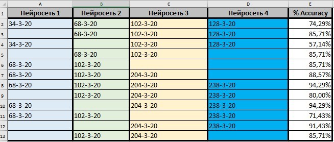
There is a table with data in Excel. There is also a chart based on this data.
Spreadsheet in Excel: 
Different combination of 4 neural networks gives different Accuracy results. Each neural network has its own characteristics (they are indicated as numbers separated by a hyphen).
For clarity: The combination of 4 neural networks with different characteristics: [34-3-20], [68-3-20], [102-3-20], [128-3-20] gave an accuracy of 74.29% etc.
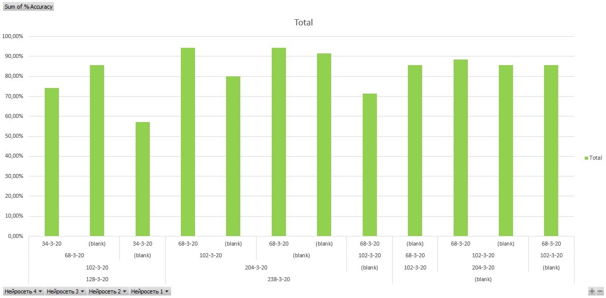
The chart looks like:
In Excel, if a network with the same characteristics was used in combinations, then a union was performed on the chart. I wanted for each accuracy result below (along the X axis) to show all the neural networks that gave such a result (even if they are repeated, they still show again). But by default, Excel did the merge. I would also like to avoid the word " blank " in the diagram.
For example, for an accuracy of 74.29% below in the diagram, I wanted 4 neural networks to be specified: [34-3-20], [68-3-20], [102-3-20], [128-3 -20]
For an accuracy of 85.71% , below in the diagram I wanted 3 neural networks to be indicated: [68-3-20], [102-3-20], [128-3-20]
Question:is it possible somehow in the settings of the Excel chart to make it so that the chart along the X axis does not have a union according to the used neural networks in combinations? And is it possible to somehow get rid of " blank "?
Uploaded Excel file to DropBox: Excelchart[SO].xlsx
Answer the question
In order to leave comments, you need to log in
And is it possible to somehow get rid of "blank"?
Didn't find what you were looking for?
Ask your questionAsk a Question
731 491 924 answers to any question