Answer the question
In order to leave comments, you need to log in
How to prevent elements from "flowing" on top of each other when resizing the browser window?
Greetings! How it is possible to forbid "leakage" of elements on each other?
For example, if the element "leaks", then it is transferred to a new line, i.e. under the element on which it flowed?
Here, I sketched an example (in the first image, the browser window is open to full screen. In the second image, the window is reduced): 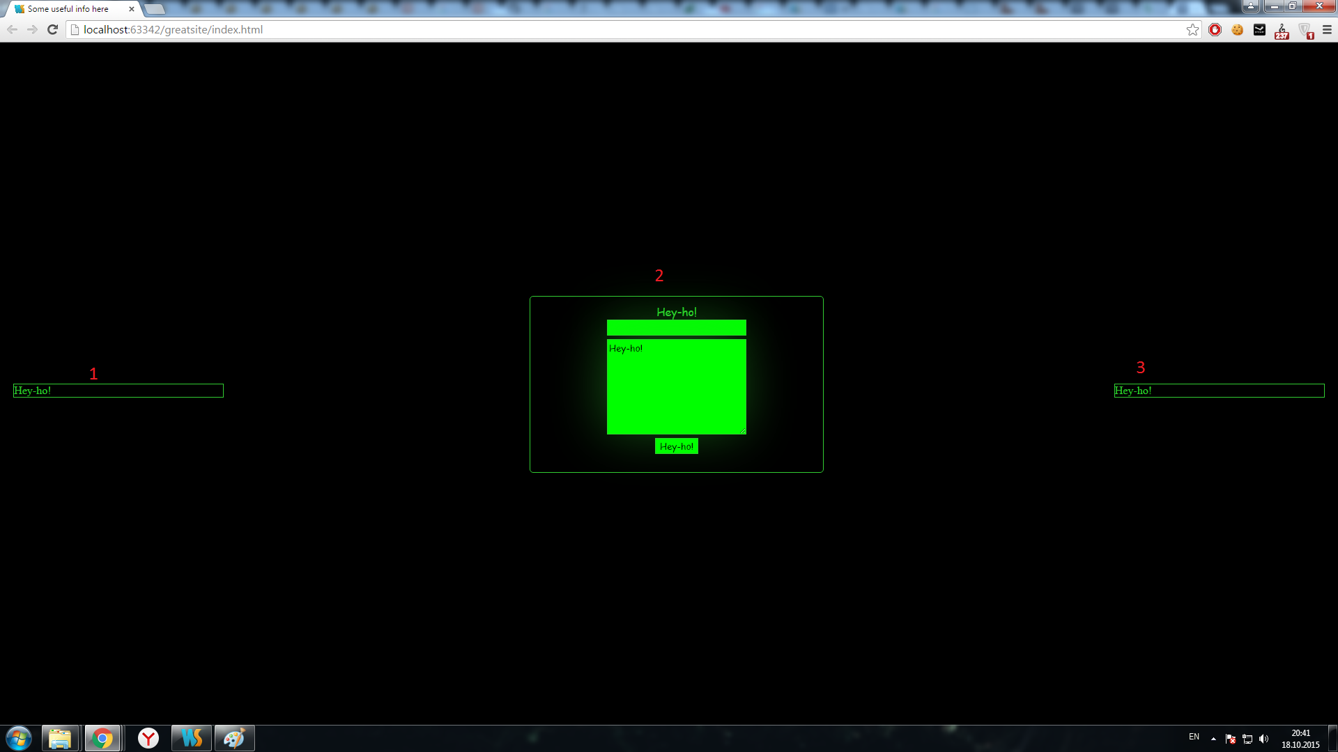
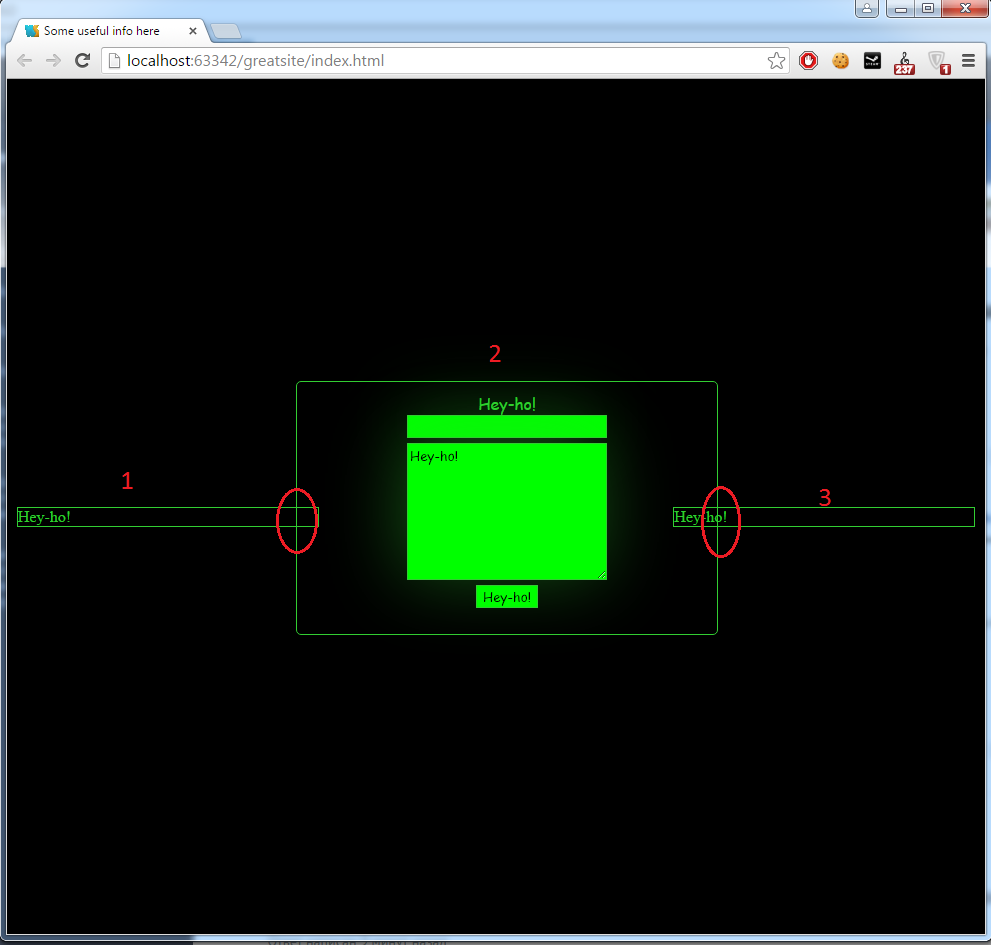
Regarding this example, you need to make sure that the element "1" when flowing onto the element "2" goes up, and the element "3" when flowing element "2" went down.
I hope I explained clearly. Where to dig?)
Answer the question
In order to leave comments, you need to log in
If they showed a live example, it would be easier. There is an option to use @media.
With a screen resolution of max-width: 768, for example, make the width of the blocks equal to 100%, not 33%
Didn't find what you were looking for?
Ask your questionAsk a Question
731 491 924 answers to any question