Answer the question
In order to leave comments, you need to log in
How to overlay a grid on a website design?
I found just such a picture, 
as I understand it, this is a 12-column grid superimposed on the design of the site.
Here is another downloaded design, 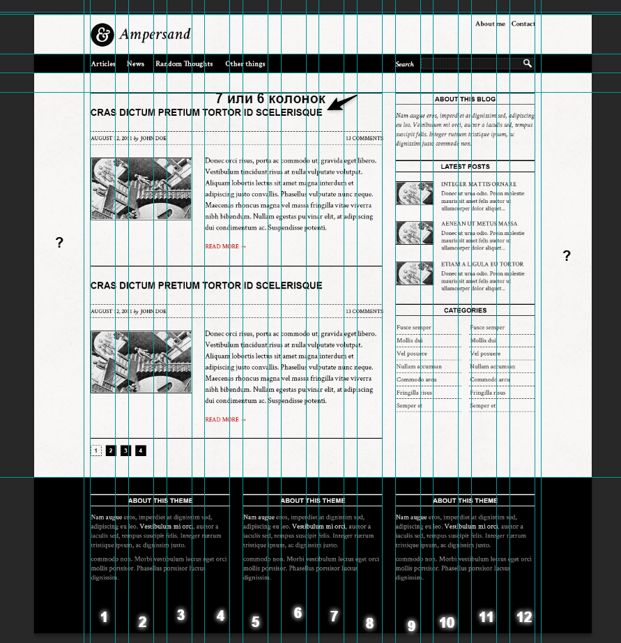
here too, 12 columns, if you turn on the guides, you can see them. Where there are numbers, I signed the columns. I don’t understand what the areas on the left and right are where the question marks are? If the width of the site is 12 columns and the indents between them, by the way, the indents on the left are the first and the last on the right, they are less than the rest.
Just how to split the columns, indicated in the screenshot, set 6 or 7 columns for the header? there the letter "E" comes to the beginning of the 7th column. The same applies to other similar cases.
And what if the design is without such a grid? Has anyone experienced this in practice? Maybe there is a 12 column grid template that is superimposed on the site design, if there is no such grid?
It turns out even if the site has 12 columns, but the indents between them and the width of the columns may differ depending on the resolution, for example 960px or 1200px, and you need a new grid every time? Maybe a generator? Do not offer completely ready-made grids, I am still learning to create my own.
Answer the question
In order to leave comments, you need to log in
1. Above indicated a plug-in for Photoshop that arranges a grid.
2. In general, I arranged this grid myself in a couple of minutes. Set the grid in the Photoshop settings ( the settings for this grid are Edit - Preferences - Guides, grid and slices, and the grid itself is turned on by Ctrl + ' ) by 8px (this value is for convenience, well, I just like to do it this way under 960; you can count others values based on goals) and divide the guides by the required number of columns (6, 8, 12, etc.) that is a multiple of the 8px module. Then you draw vertical translucent rectangles and arrange them as needed. Everything, the grid is ready.
Accordingly, for a different window width, you will have to make a new layout with a new width of the columns (if you mean changing their width). In my practice, for a layout designer, a layout for the minimum and maximum widths is enough. Then he himself.
Ready not to offer, but just in case, I'll leave it here:
3. If you're too lazy to set it up yourself, then google "XXX grid psd", where XXX is the width of the layout and / or an indication of other features (for example, bootstrap).
Request example
4. Sites like 960.gs with a ready-made grid for a width of 960px. On the main page, you can simply download ready-made templates with a grid applied. Actually, upon request in a search engine, you can download the same templates for different layout widths.
There are fixed-width grids, and there are adaptive ones. In the case of fixed-width grids, there is always of course a variable margin on the sides. Responsive grids change width depending on the resolution, but they can also have margins on the sides.
Grids differ, of course, both in the number of columns and in the size of these columns, the gaps between them.
To the question about the header, only the author of the layout knows the answer, apparently - whether he thought that there should be some kind of indentation on the right or not. Most likely it means that the title can be 8 columns wide.
Didn't find what you were looking for?
Ask your questionAsk a Question
731 491 924 answers to any question