Answer the question
In order to leave comments, you need to log in
How to organize android UI to select connection type?
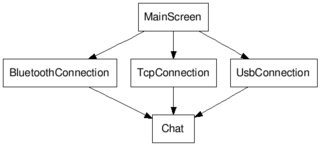
I am developing a simple chat with the ability to choose to connect via Bluetooth, USB or TCP / IP. What is the best way to organize the interface so that it looks natural for the platform? The sequence of user actions will be as follows: select the connection type (MainActivity), configure the connections for the selected type (for example, select the bluetooth device for pairing (BtConnectionActivity)), enter the chat (ChatActivity) 
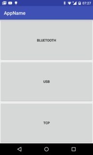
The MainActivity interface is so far, 
but it seems to me that it looks like - something clumsy. Are there any standards/recommendations?
Answer the question
In order to leave comments, you need to log in
https://www.google.com/design/spec/
And in general, look at the application from the point of view of the user who launched the application for the first time. What are the buttons? What happens after clicking on any of them? In this case, IMHO, a short description, a select with the connection type and the "Connect" button can help.
1) Must have padding (inner "fields" on all sides of the activity)
2) Buttons should not be too big, it's confusing on any platform. For mobile phones (NOT tablets) it is enough to make them of standard height, but the length of the screen (and all this in the center), or arrange them horizontally, each 1/3 of the screen (+padding). Alternatively, you can use the standard dialogs to try, then maybe on the tablets there will immediately be norms without crutches, I have not tried this.
3) There should be a brief explanation of what it is and why.
4) ... And here we smoothly move on to the main remark on this issue:
Why is all this needed at all? What is the purpose of the 3 modes and what is the purpose of this dialogue at this place?
What is chat via bluetooth or USB, is such a miracle really necessary for the user?
If all this really needs to load the user, then the signatures on the buttons (or explanation) must be done based on this, and the user does not have to know our jargon about "TCP".
Or maybe you don’t need to, just make 1 option the default, then in the settings?
If you do everything topsy-turvy - first come up with some kind of solution, and then try to coordinate it with the task (instead of first setting the task, and then solving it), then a convenient interface will not work.
Didn't find what you were looking for?
Ask your questionAsk a Question
731 491 924 answers to any question