Answer the question
In order to leave comments, you need to log in
How to nail the block to the right and align with the .container above?
Situation:
Container max-width: 1300px, margin: 0 auto
Make it not like this when narrowing the window:
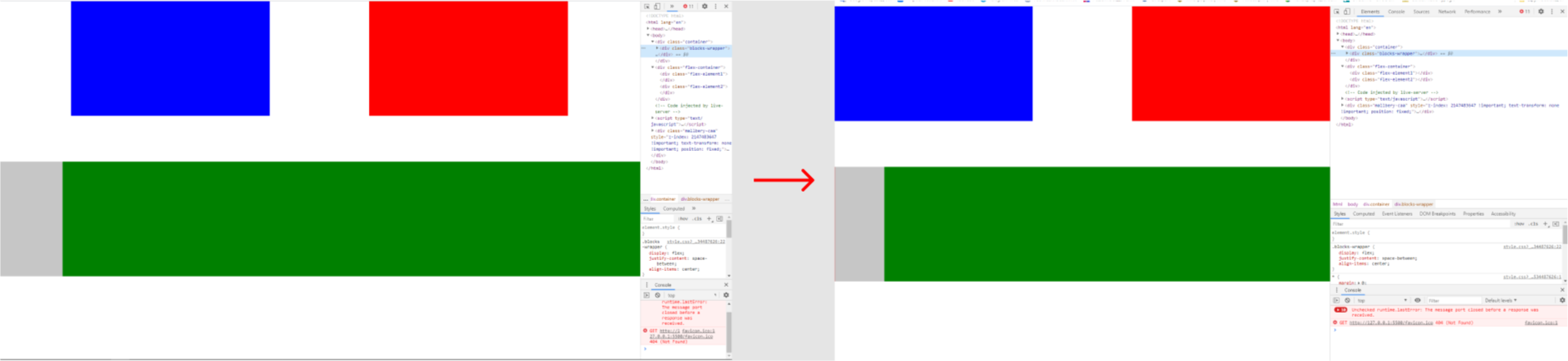
But like this:
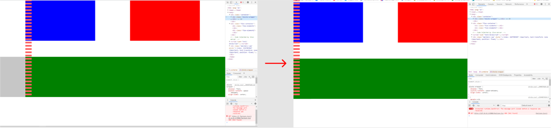
The point is that the green block should be pushed to the right edge, and aligned with the beginning of the container.
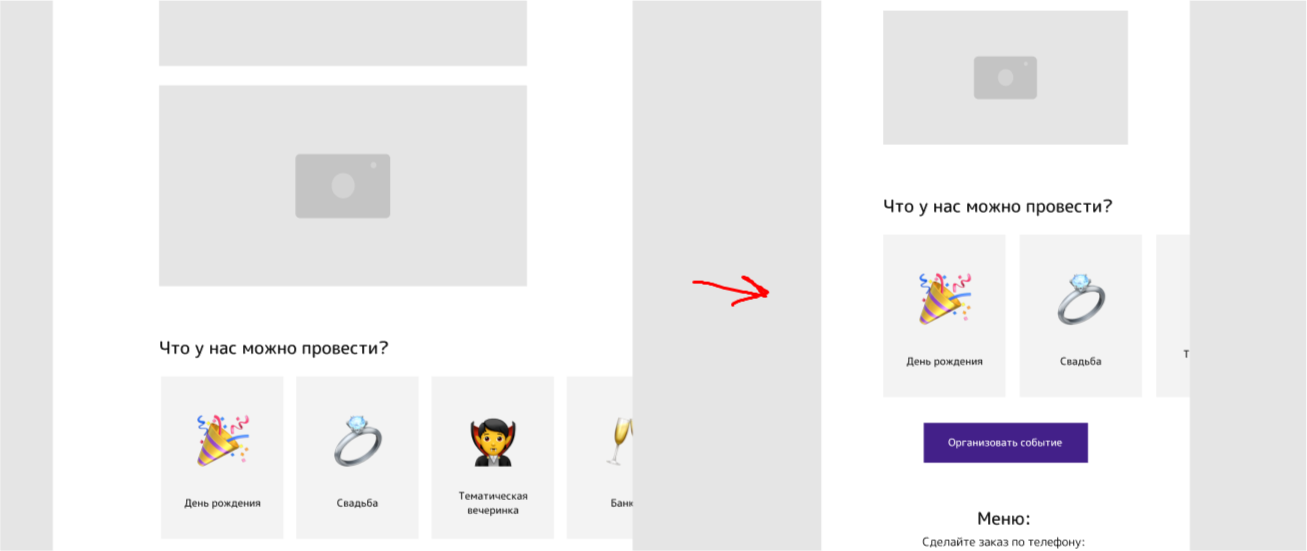
In the mobile version, there is a slider on owl carosel
and should look like this:
<div class="container">
        <div class="blocks-wrapper">
            <div class="blocks"></div>
            <div class="blocks"></div>
        </div>
    </div>

        <div class="flex-container">
            <div class="flex-element1"></div>
            <div class="flex-element2"></div>
        </div>
* {
margin: 0;
padding: 0;
box-sizing: border-box;
}
.container {
max-width: 1300px;
margin: 0 auto;
}
.blocks {
height: 300px;
width: 40%;
background: red;
}
.blocks:first-child {
background: blue;
}
.blocks-wrapper {
display: flex;
justify-content: space-between;
align-items: center;
}
.flex-container {
margin-top: 120px;
background: #aaaa;
display: flex;
justify-content: space-between;
}
.flex-element1 {
max-width: 100%;
width: 1px;
height: 300px;
background: rgb(221, 92, 92);
}
.flex-element2 {
max-width: 100%;
width: 90%;
height: 300px;
background: green;
}Answer the question
In order to leave comments, you need to log in
Take the green block out of the container and give it a similar style
.green-wrapper {
  margin-left: calc(50% - 1300px/2);
}Didn't find what you were looking for?
Ask your questionAsk a Question
731 491 924 answers to any question