Answer the question
In order to leave comments, you need to log in
How to make twitter bootstrap so that one column has a fixed width in pixels, and the rest are fluid?
I am using twitter bootstrap.
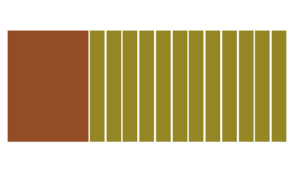
Is it possible to somehow fit a block with a fixed width in pixels in one line, and fill the rest of the space with 12 bootstrap columns so that they are fluid and act as if there is no fixed-width block in the line?
Answer the question
In order to leave comments, you need to log in
Don't use bootstrap where you don't need it. A fixed column can (and is easier) be done with your own CSS code.
Not possible in the classic version. See templates for the admin panel, some seem to have a fixed width of the admin bar.
Flexbox layout works great for this. You can either do handles for a specific block (which is a priority if you are already using other frameworks), or take flexboxgrid (Auto-Width section).
make 2 blocks, the first one is your fixed one, and inside the second one place a new row (.row) and cells in it
Didn't find what you were looking for?
Ask your questionAsk a Question
731 491 924 answers to any question