Answer the question
In order to leave comments, you need to log in
How to make this slide (PO) more clear, clearer, more beautiful?
Good day to all!
It is necessary to present briefly about the problems in the existing software and the proposed solutions. I posted information on the page, but unfortunately I do not have knowledge in the field of design and content. Please express your criticism and proposed solutions on this page. How to make it better, more readable, clearer and more beautiful?
Maybe there are some examples?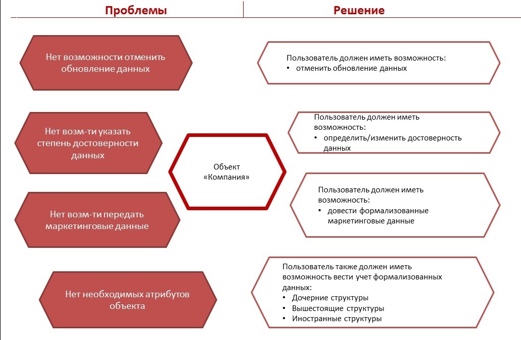
Answer the question
In order to leave comments, you need to log in
1. Problems and solutions to them duplicate each other. There are no solutions as such. There are no specific options, namely how the software (or its separate function) will solve the existing problems.
2. Try to present the information in the form of a table:
- removing the "Object-company" block,
- placing "Problems", "Solutions" in the header,
- it is better to reduce the problems, and therefore reformulate them. For example: Unable to cancel data refresh. The smaller the text, the greater the chance that it will be read.
- Describe specific solutions.
- The color of the table borders and cells should match the main color of your presentation.
- The text is larger and the same color. Let's say black. The text in the header is bold and slightly larger than the text in the body of the table.
3. Each slide in the presentation needs to have a title.
Didn't find what you were looking for?
Ask your questionAsk a Question
731 491 924 answers to any question