Answer the question
In order to leave comments, you need to log in
How to make the margin property for containers or buttons rubber?
Application in C# + WPF
There are 4 buttons in the stack panel
of the stack panel and the buttons have a certain margin (margin)
Everything that is in the program is resized if I stretch or narrow the window, that is, I change the size of the program window.
But the problem is that the margin remains the same for all controls, and accordingly, with a different size of the program window, everything looks different
. How can margin be made not absolute, but relative?
for normal window size: 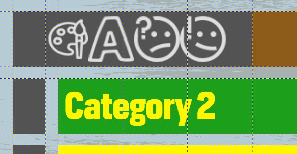
for other window size: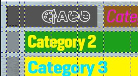
<StackPanel x:Name="optionsMenuBox"
                      Grid.Column="1"
                      Grid.Row="1"
                      Grid.ColumnSpan="5"
                      Margin="0 0 500 0"
                        Background="#535353"
                        Orientation="Horizontal">
                    <Button Click="ChangeCategoryColor"
                            x:Name="ColorPicker"
                            Margin="70 20 20 20"
                            Style="{StaticResource OptionButton}">
                        <Image Source="images/icons/palette.png"
                               Stretch="Uniform" />
                    </Button>

                <Button Click="OpenFontWindow"
                        x:Name="FontWindowButton"
                        Margin="0 20 20 20"
                        Style="{StaticResource OptionButton}">
                    <Image Source="images/icons/fonts.png"
                           Stretch="Uniform" />
                </Button>

                <Button Click="OpenQuestWindow"
                        x:Name="QuestWindowButton"
                        Margin="0 20 20 20"
                        Style="{StaticResource OptionButton}">
                    <Image Source="images/icons/questcards.png"
                           Stretch="Uniform" />
                </Button>

                <Button Click="OpenSentenceWindow"
                        x:Name="SentenceWindowButton"
                        Margin="0 20 20 20"
                        Style="{StaticResource OptionButton}">
                    <Image Source="images/icons/non-quest-cards.png"
                           Stretch="Uniform" />
                </Button>
</StackPanel>Answer the question
In order to leave comments, you need to log in
The whole point of WPF, avoiding the fact that elements are strictly sticky as they were on WindowForms. And when resizing, all elements should retain not certain sizes, but the proportions of their location. That is why markup is used.
Don't put everything in one Grid. Therefore, everything is crawling. Also, do not use Column and describe the location of the content through Grid.Column/Row. Since when adding new Grids, all this numbering will have to be changed. If you're just aligning the content in a StackPanel, then it's better to use Padding rather than Margin. It is also worth digging into the alignment, since certain numerical values \u200b\u200bare the same and remain the same when resizing.
I have finalized the code from the point of view of Grid, it is better to prescribe your own for each element, then everything will remain in place. Also, from the point of view of MVVM in XAML, you do not need to throw interactions. It's all written in CS where I wrote it, the names of the buttons are the same. In XAML, only the name of the element is set, and already through it in cs there is an interaction there and registered it, the names left the same, they are indicated in XAML.
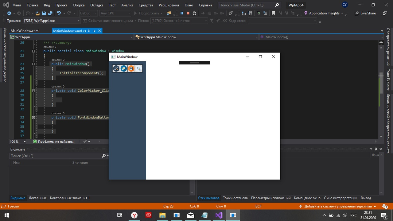
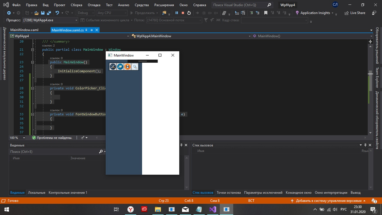
XAML didn't attach( so screen 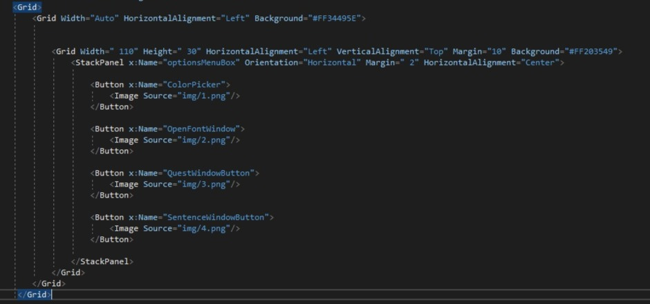 ((
((
CS
public MainWindow()
{
InitializeComponent();
}
private void ColorPicker_Click(object sender, RoutedEventArgs e)
{
}
private void FontWindowButton_Click(object sender, RoutedEventArgs e)
{
}
private void QuestWindowButton_Click(object sender, RoutedEventArgs e)
{
}
private void SentenceWindowButtonr_Click(object sender, RoutedEventArgs e)
{
}
Didn't find what you were looking for?
Ask your questionAsk a Question
731 491 924 answers to any question