Answer the question
In order to leave comments, you need to log in
How to make the Boostrap 5 navbar have two rows?
I'm using Bootstrap 5.
According to the layout, the header should be divided into two rows.
In the first row there should be a logo-link in the form of a logo image and with a screen resolution of up to 960px (lg) there should be an icon with a menu at the end.
The second row should contain a menu with a search icon at the end.
Bootstrap 5 has a template code for a one-line navigation bar, please help me to change it:
<nav class="navbar navbar-expand-lg navbar-light bg-light">
  <div class="container-fluid">
    <a class="navbar-brand" href="#">Navbar</a>
    <button class="navbar-toggler" type="button" data-bs-toggle="collapse" data-bs-target="#navbarSupportedContent" aria-controls="navbarSupportedContent" aria-expanded="false" aria-label="Toggle navigation">
      <span class="navbar-toggler-icon"></span>
    </button>
    <div class="collapse navbar-collapse" id="navbarSupportedContent">
      <ul class="navbar-nav me-auto mb-2 mb-lg-0">
        <li class="nav-item">
          <a class="nav-link active" aria-current="page" href="#">Home</a>
        </li>
        <li class="nav-item">
          <a class="nav-link" href="#">Link</a>
        </li>
        <li class="nav-item dropdown">
          <a class="nav-link dropdown-toggle" href="#" id="navbarDropdown" role="button" data-bs-toggle="dropdown" aria-expanded="false">
            Dropdown
          </a>
          <ul class="dropdown-menu" aria-labelledby="navbarDropdown">
            <li><a class="dropdown-item" href="#">Action</a></li>
            <li><a class="dropdown-item" href="#">Another action</a></li>
            <li><hr class="dropdown-divider"></li>
            <li><a class="dropdown-item" href="#">Something else here</a></li>
          </ul>
        </li>
        <li class="nav-item">
          <a class="nav-link disabled" href="#" tabindex="-1" aria-disabled="true">Disabled</a>
        </li>
      </ul>
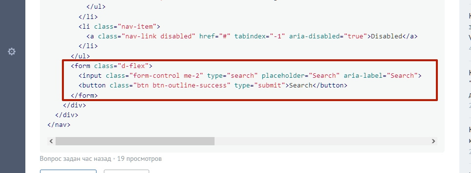
      <form class="d-flex">
        <input class="form-control me-2" type="search" placeholder="Search" aria-label="Search">
        <button class="btn btn-outline-success" type="submit">Search</button>
      </form>
    </div>
  </div>
</nav>Answer the question
In order to leave comments, you need to log in
Look in the documentation for separate code for navigation and form. Divide the Header into two rows col-md-12+ col-md-12and insert the found parts into separate columns.
Here is the search form separately. You can cut it out of the navigation and paste it into another column.

I'm building on Bootstrap 5.
Didn't find what you were looking for?
Ask your questionAsk a Question
731 491 924 answers to any question