Answer the question
In order to leave comments, you need to log in
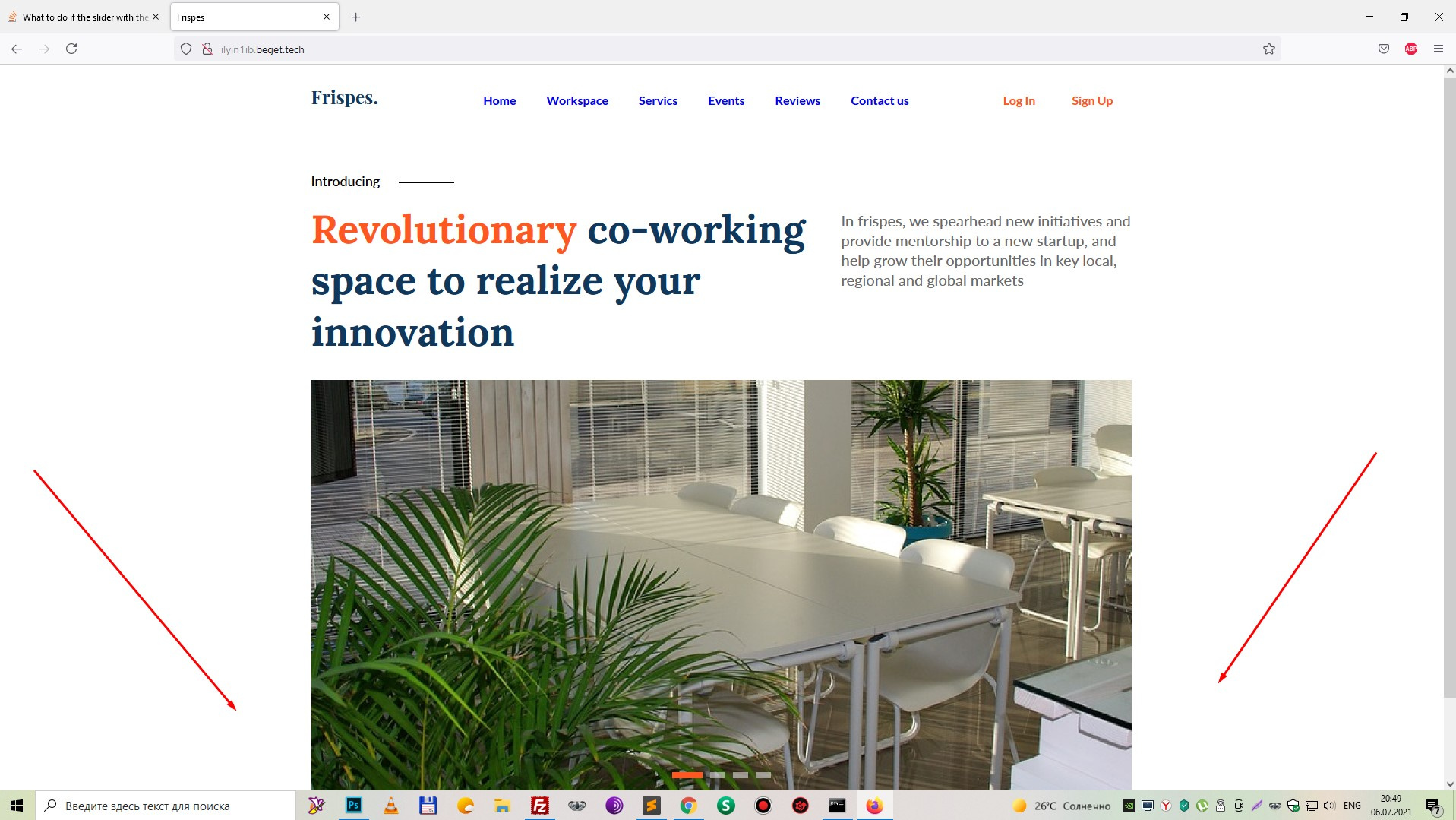
How to make sure that the image in the Slick-slider is not cut off when the screen size is reduced?
How in slick-slider to make sure that the image is not cut off at ANY screen resolutions? I mean that the picture that you see on the desktop version was also visible at small screen resolutions without cropping? I've tried object-fit, both alone and in conjunction with various properties. I also tried this method, that the .item block in which the photo is stored is given the following properties:
overflow: hidden;
   position: relative;
   width: 100%;
padding-bottom: 100%;position: absolute;
top: 0;
left: 0;
width: 100%;
height: 100%;
background-size: 100% 100%;
Answer the question
In order to leave comments, you need to log in
Didn't find what you were looking for?
Ask your questionAsk a Question
731 491 924 answers to any question