Answer the question
In order to leave comments, you need to log in
How to make such a block on bootstrap 4?
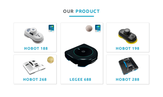
I can't figure out how to type. I can separately for desktop and separately for mobile devices. But so that when the screen is reduced, the desktop version looks like the version for mobile devices, I can’t figure out how best to do this. I'm afraid to write a crutch. This is the desktop version. 
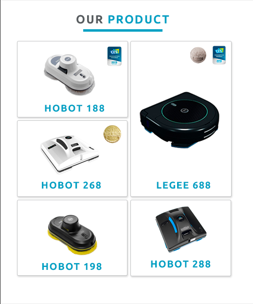
and this is what the version for mobile devices looks like
Answer the question
In order to leave comments, you need to log in
I, too, after a long hibernation, did not know this.
The essence of media queries.
Google it.
The meaning is this:
in CSS write:
.item {
width:100%;
}

/* а тут создаете условие для итема */

@media (max-width:500){

.item {
width:50%;
}

}<!-- Mobile Specific Meta -->
<meta name="viewport" content="width=device-width, initial-scale=1, maximum-scale=1">Didn't find what you were looking for?
Ask your questionAsk a Question
731 491 924 answers to any question