M
M
MFNIK2021-04-22 14:51:02
Slick
MFNIK, 2021-04-22 14:51:02

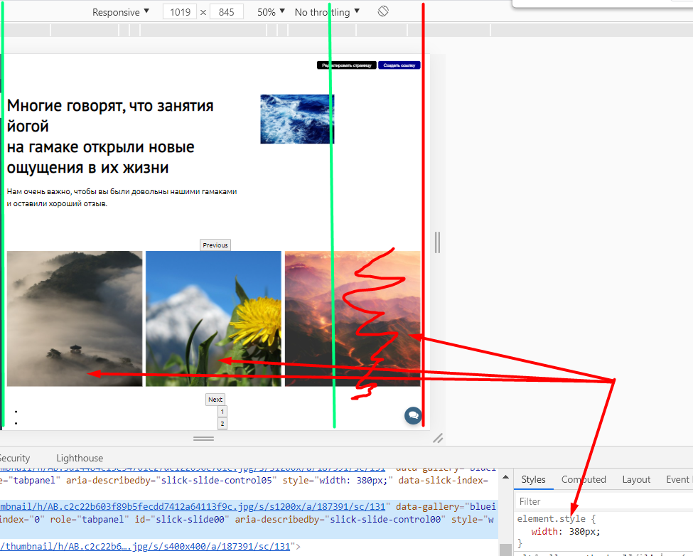
How to make SLick Slider not go beyond the edges of the screen, and adapt the elements to the width of the screen?

Essence! There is a site with a slider in it. Here are the settings.

$(document).ready(function(){
  $('.slider-block #links').slick({
    slidesToShow: 3,
    infinite: true,
    slidesToScroll: 1,
    arrows: true,
    dots: true,
    responsive: [
      {
        breakpoint: 760,
        settings: {
          slidesToShow: 2
        }
      }
    ]
  });
});


I do not understand why the slider scales the elements in such a way that they go beyond the page border?
Previously, when I set this slider, it scaled the elements based on the width of the screen, but now it pulls them out of the width.

It should compress the pictures in this case 3 pieces, to the width that they fit into the width of the screen. 11vcnzv

Tell me what happened to him, before such problems were not.

PS The picture didn't load..... For some reason he thinks that the page border is on the red line, and therefore he assigns the width to the element.608164641bcc8701449593.png

Answer the question

In order to leave comments, you need to log in

Didn't find what you were looking for?

Ask your question

Ask a Question

731 491 924 answers to any question