Answer the question
In order to leave comments, you need to log in
How to make responsive text in a fixed width block?
I am writing an application in Vue js
. There is a fixed size block, it has text.
It is necessary that the text fit completely into the block. The text can be completely different (in the future it will be taken from the database)
. the font is changed so that the text fits completely into the block
How can this be done?
It is not necessary to do it using Vue, you can also use css
. At the moment, I have this:
<div class="question-card">
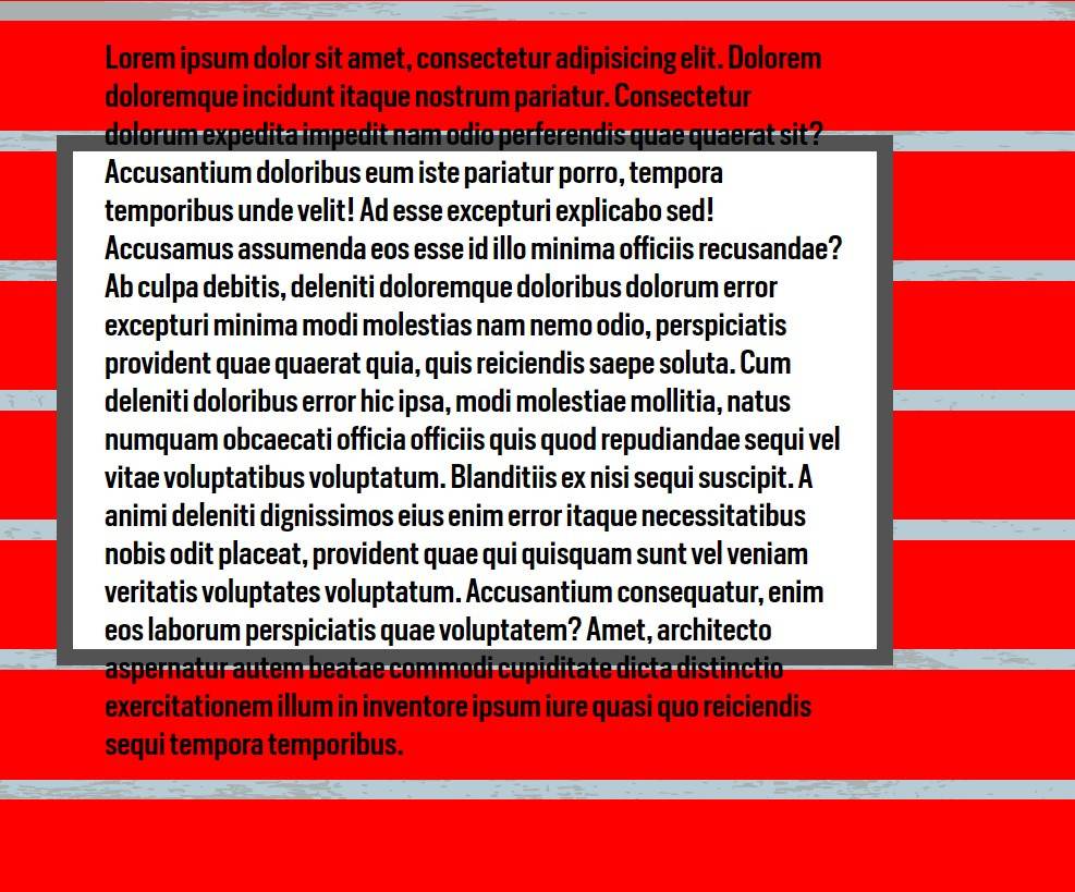
<p class="question-text">Lorem ipsum dolor sit amet, consectetur adipisicing elit. Dolorem doloremque incidunt itaque nostrum pariatur. Consectetur dolorum expedita impedit nam odio perferendis quae quaerat sit? Accusantium doloribus eum iste pariatur porro, tempora temporibus unde velit! Ad esse excepturi explicabo sed! Accusamus assumenda eos esse id illo minima officiis recusandae? Ab culpa debitis, deleniti doloremque doloribus dolorum error excepturi minima modi molestias nam nemo odio, perspiciatis provident quae quaerat quia, quis reiciendis saepe soluta. Cum deleniti doloribus error hic ipsa, modi molestiae mollitia, natus numquam obcaecati officia officiis quis quod repudiandae sequi vel vitae voluptatibus voluptatum. Blanditiis ex nisi sequi suscipit. A animi deleniti dignissimos eius enim error itaque necessitatibus nobis odit placeat, provident quae qui quisquam sunt vel veniam veritatis voluptates voluptatum. Accusantium consequatur, enim eos laborum perspiciatis quae voluptatem? Amet, architecto aspernatur autem beatae commodi cupiditate dicta distinctio exercitationem illum in inventore ipsum iure quasi quo reiciendis sequi tempora temporibus.
</p>
</div>.question-card {
position: absolute;
top: 25%;
left: 30%;
width: 40%;
height: 50%;
background-color: #fff;
border: 15px solid #535353;
justify-content: flex-start;
padding: 1.5%;
display: flex;
align-items: center;
}
.question-text {
font-family: "HeronSansCond Medium", sans-serif;
text-align: left;
margin: 0;
padding: 0;
font-size: 1.5vw;
}
Answer the question
In order to leave comments, you need to log in
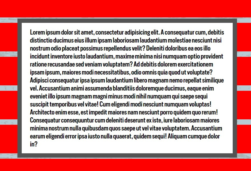
I found a solution to the problem by applying qqFE and pupenne
hints. I
just adapted everything for Vue js:
Video
html:
<div class="question-card" ref="card">
      <p
        class="question-text"
        ref="cardText"
        :style="{ fontSize: fontSize + 'rem' }"
      >
        {{ text }}
      </p>
</div><script>
export default {
beforeCreate() {
this.calculateFontSize();
},
mounted() {
this.calculateFontSize();
},
data: () => ({
textWidth: 0,
cardWidth: 0,
cardHeight: 0,
textHeight: 0,
fontSize: 6,
text:
"there is an ejecting or lifting force, acting on a body immersed in a liquid or gas, which is equal to the weight of the volume of the liquid or gas displaced by the part of the body immersed in the liquid or gas –Law of Archimedes\n",
options: {
minSize: 11,
maxSize: 120
}
}),
created() {
window.addEventListener("resize", this.calculateFontSize);
},
destroyed() {
window.removeEventListener("resize", this.calculateFontSize);
},
methods: {
calculateFontSize() {
//get font size of text and card height
let fontSize = this.fontSize;
      let textHeight = this.$refs.cardText.clientHeight;
      let cardHeight = this.$refs.card.clientHeight - 50;
//compare card height and text height
if (textHeight >= cardHeight) {
        this.fontSize = fontSize - 0.1;
      } else if (textHeight < cardHeight) {
        this.fontSize = fontSize + 0.1;
      }
//apply card width and height to category text when resizing window
this.cardWidth = this.$refs.card.clientWidth;
      this.cardHeight = this.$refs.card.clientHeight;
      this.textWidth = this.$refs.cardText.clientWidth;
      this.textHeight = this.$refs.cardText.clientHeight;
}
}
};
</script>let fontSize = this.fontSize;
let textHeight = this.$refs.cardText.clientHeight;
let cardHeight = this.$refs.card.clientHeight - 50;if (textHeight >= cardHeight) {
this.fontSize = fontSize - 0.1;
} else if (textHeight < cardHeight) {
this.fontSize = fontSize + 0.1;
}this.cardWidth = this.$refs.card.clientWidth;
this.cardHeight = this.$refs.card.clientHeight;
this.textWidth = this.$refs.cardText.clientWidth;
this.textHeight = this.$refs.cardText.clientHeight;<html>
<head>
<meta name="viewport" content="width=device-width, initial-scale=1">
<style>
div.example {
background-color: lightgrey;
padding: 20px;
}
@media screen and (min-width: 601px) {
div.example {
font-size: 80px;
}
}
@media screen and (max-width: 600px) {
div.example {
font-size: 30px;
}
}
</style>
</head>
<body>
<h2>ратата</h2>
<div class="example">ТEКСТ В БЛОКЕ</div>
</body>
</html>Do a while( If the height of div is less than p), then decrease the font-size otherwise exit the loop.
The idea is to compare the heights of the parent block (div) and the text block in it (p). And if the text block is taller than the parent block, then you need to reduce the font size.
Didn't find what you were looking for?
Ask your questionAsk a Question
731 491 924 answers to any question