Answer the question
In order to leave comments, you need to log in
How to make iPhone adaptive?
I made this layout: I'm 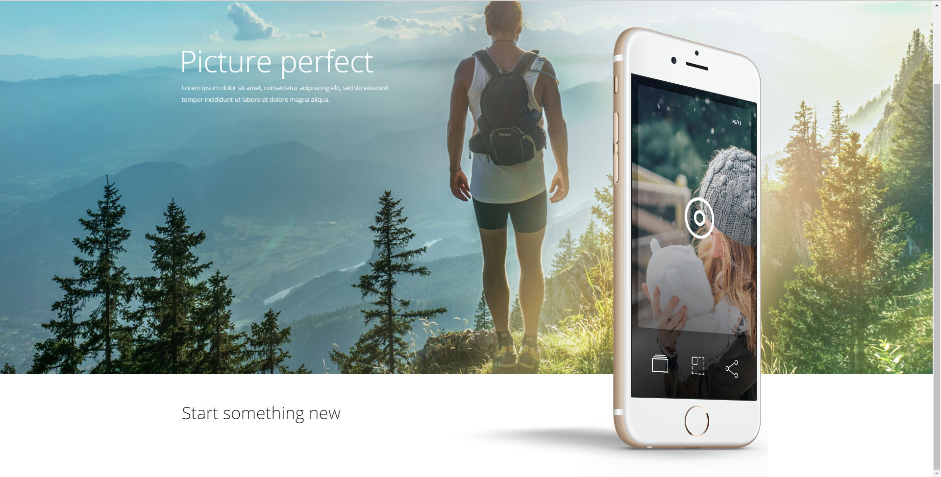
interested in the picture of the iPhone, in fact its code:
<header>
  <div class="head-wrapper">
    <div class="iphone-img"></div>
  </div>
</header>
header
background-image: url('../img/header-bg.jpg')
height: 100vh
max-height: 950px
width: 100%
background-position: center
background-repeat: no-repeat
background-size: cover
background-color: pink
background-position: center
.head-wrapper
margin: 0 auto
max-width: 1230px
width: 100%
position: relative
.iphone-img
position: absolute
background-position: center
background-image: url('../img/iphone-img.png')
background-size: contain
background-repeat: no-repeat
height: 250%
width: 100%
max-height: 920px
  max-width: 650px
bottom: -190%
right: 0%Answer the question
In order to leave comments, you need to log in
Of course, we will immediately analyze the context from the code and understand exactly how your site looks on your browser and on your computer. There is a problem - simulate it in the codepen, and only then send it to the toaster.
Didn't find what you were looking for?
Ask your questionAsk a Question
731 491 924 answers to any question