Answer the question
In order to leave comments, you need to log in
How to make "dynamic" padding?
I'm learning to typeset...
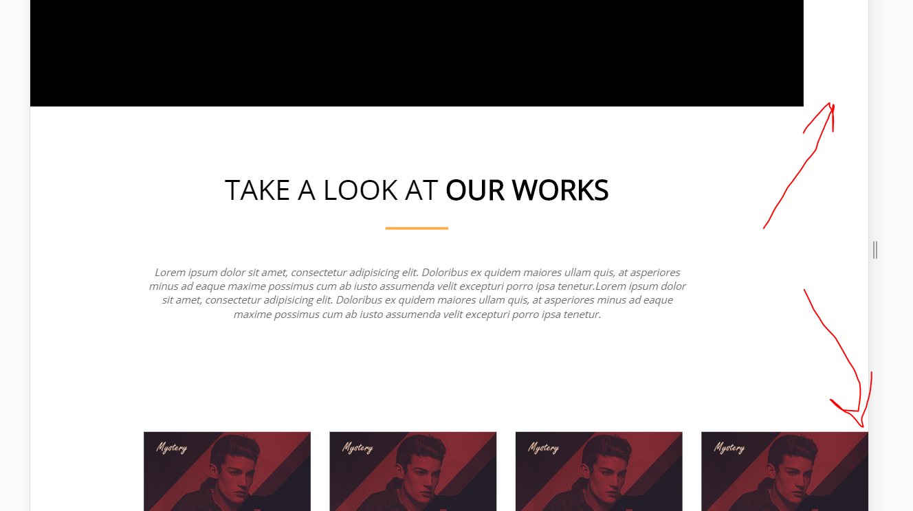
I made a block, placed elements in it, set padding to the block.
The problem is that when I change the width of the window in dev-tools, at a certain moment the pictures start to "climb out" to the right, and then completely go off the screen. 
Yes, this problem can be solved with media queries, but they kind of hard-code the padding.
I would like that when the window width decreases, when the content does not fit into the container frame, then the content either runs over the padding, or the padding decreases.
Here is a sample code: https://codepen.io/Drovosek/pen/MqxONW
Answer the question
In order to leave comments, you need to log in
How to properly layout a content container:
.container {
  width: calc(100% - 32px);  // отступ по 16px в случае если страница <= 1024px
  max-width: 1024px;  // размер для примера
  margin: 0 auto;
}.container {
width: 100%;
max-width: 1056px;
margin: 0 auto;
padding: 0 16px;
}https://codepen.io/topicstarter/pen/NLJyQa?editors=1100
here I did not fix the layout, but slightly corrected css - added three lines
Didn't find what you were looking for?
Ask your questionAsk a Question
731 491 924 answers to any question