Answer the question
In order to leave comments, you need to log in
How to make adaptive images in a row?
Hello everyone, there are pictures how to arrange them in a row and make adaptability. To shrink when screen size changes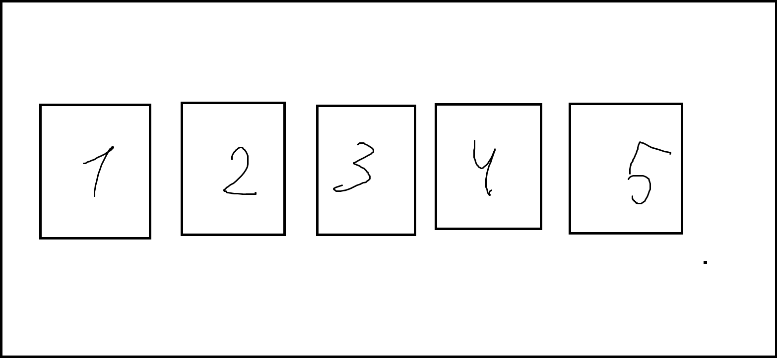
<section class="rp" id="rp">
      <div class="container">
        <h2 class="text-center text-uppercase text-secondary mb-0">Процесс работы</h2>
      </div>
    <div class="rposn">
    <img src="../img/5.png" >
    <img src="../img/4.png" >
    <img src="../img/3.png" >
    <img src="../img/2.png" >
   <img src="../img/1.png" >
  </div>
</section>Answer the question
In order to leave comments, you need to log in
Didn't find what you were looking for?
Ask your questionAsk a Question
731 491 924 answers to any question