Answer the question
In order to leave comments, you need to log in
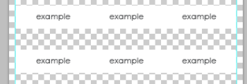
How to make a table like this?
From a regular monitor, the table is displayed as is, 6 cells. And when viewed from mobile ( media (max-width: 599px) )
It should be displayed 3 cells in a row.
example
From a regular monitor 
From small screens 
Please tell me how to make it up?
Answer the question
In order to leave comments, you need to log in
Read here
There is an item Responsive Makes the table adaptive for different screen sizes.
There are css grids for things like this. The most popular is part of the css framework bootstrap.
I advise you to connect it, you can not all, but only grid, then the task will be solved like this:
<div class="col-xs-4 col-md-2"></div>
<div class="col-xs-4 col-md-2"></div>
<div class="col-xs-4 col-md-2"></div>
<div class="col-xs-4 col-md-2"></div>
<div class="col-xs-4 col-md-2"></div>
<div class="col-xs-4 col-md-2"></div>Didn't find what you were looking for?
Ask your questionAsk a Question
731 491 924 answers to any question