Answer the question
In order to leave comments, you need to log in
How to make a responsive block with different block size on Bootstrap?
Good afternoon, I need help creating a block with tiles, the block must be created using Bootstrap. Tiles have different sizes and shapes, but are located within the same container, so the content does not go beyond. How the block looks like is shown in the picture below. 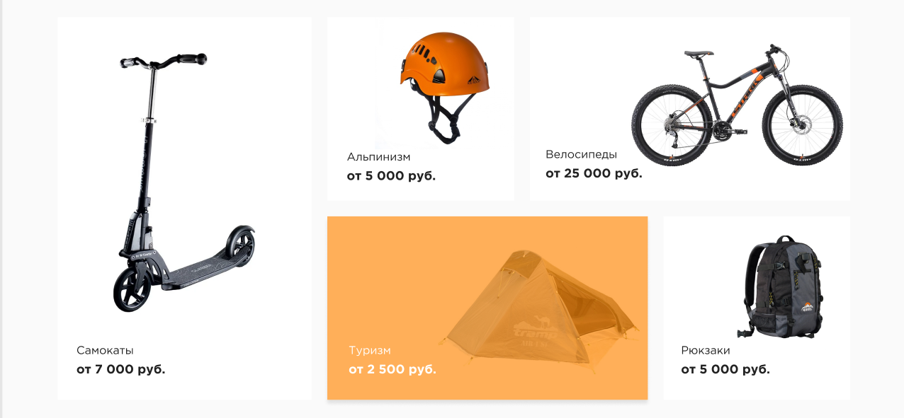
I would be grateful for any help!
PS I started working with Bootstrap recently and am just learning.
Answer the question
In order to leave comments, you need to log in
Didn't find what you were looking for?
Ask your questionAsk a Question
731 491 924 answers to any question