Answer the question
In order to leave comments, you need to log in
How to make a pyramid with CSS+HTML?
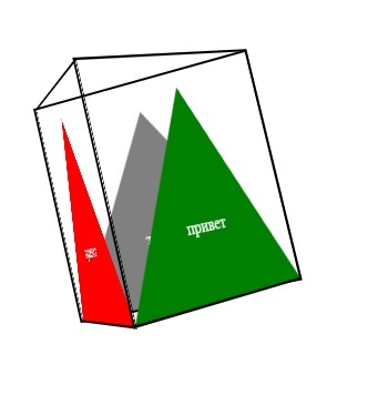
The crux of the matter is as follows. I decided to draw a tetrahedron with CSS+HTML.
I drew the sides, triangles in the sides. Added borders to make it clearer. Turned sides. But a recent discovery for me was that the sides cannot be tilted as I need. When 3d is used, the blocks cannot overlap each other ... And this is necessary. I want to ask for ideas. Please do not throw tomatoes.
<div class="wrapper">
  <div id="pyramid">
    <div class="side1 sides">
      <div class="sideSquare"></div>
      <div class="inscription">привет</div>
    </div>
    <div class="side2 sides">
      <div class="sideSquare"></div>
      <div class="inscription">привет</div>
    </div>
    <div class="side3 sides">
      <div class="sideSquare"></div>
      <div class="inscription">привет</div>
    </div>
    <div class="side4 sides">
      <div class="sideSquare"></div>
      <div class="inscription">Привет</div>
    </div>
  </div>
</div>
.wrapper {
perspective: 900px;
padding-top: 200px;
}
#pyramid {
margin:0 auto;
width: 200px;
height: 200px;
position: relative;
transform-origin: 50% 50% 100px;
transform-style: preserve-3d;
transform: rotate3d(1,1,1,0deg);
}
.sides {
transform-origin: 50% 200px -57.736px;
border: 2px solid #000;
}
.side2 {
transform: rotateX(70.529deg) rotateZ(0deg) rotateY(120deg);
}
.side1 {
transform: rotateX(70.529deg) rotateY(0deg) rotateZ(0deg);
}
.side3 {
transform: rotateX(70.529deg) rotateY(240deg) rotateZ(0deg);
}
.side4 {
display: none;
}
Answer the question
In order to leave comments, you need to log in
Maybe you should assign position: absolute to the blocks?
The problem is not clear, as the picture does not reflect it.
You need to make a rotation along the X axis of each side (around the axis that runs at the lower base of each triangle).
Didn't find what you were looking for?
Ask your questionAsk a Question
731 491 924 answers to any question