Answer the question
In order to leave comments, you need to log in
How to make a flat flex-box grid?
example
I want the free space between the elements to be distributed evenly, but at the same time the bottom square (or 2, 3) of such squares is exactly under the top squares. Your suggestions?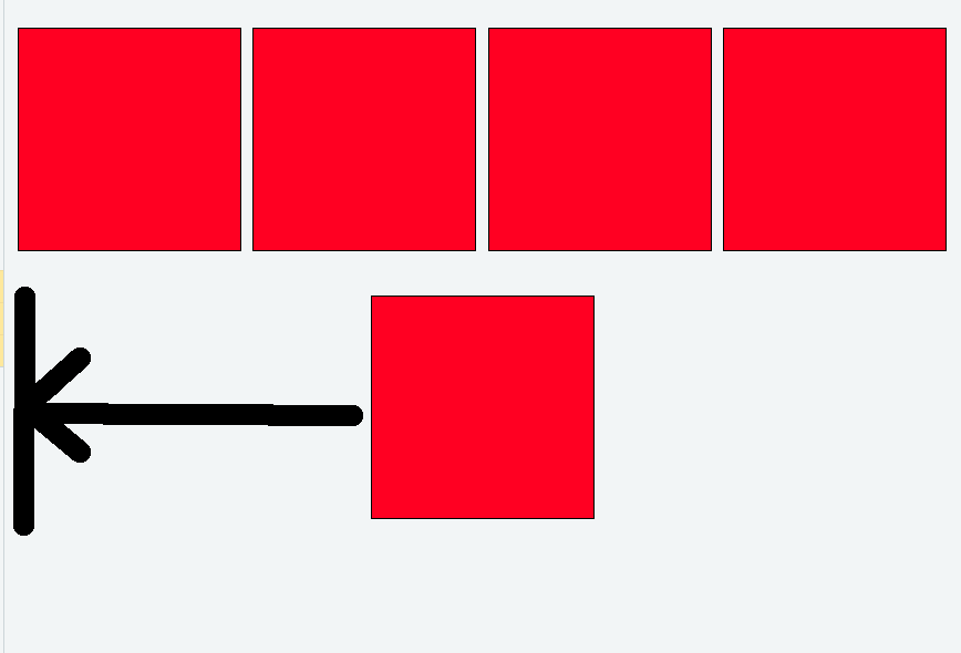
<main>
    <div></div>
    <div></div>
    <div></div>
    <div></div>
    <div></div>
  </main>
main {
display: flex;
flex-flow: row wrap;
justify-content: space-between;
}
div {
background: red;
margin: 20px auto;
flex-basis: 200px;
height: 200px;
border: 1px solid black;
}Answer the question
In order to leave comments, you need to log in
<div class="grid">

    <div>Ячейка</div>
    <div>Ячейка</div>
    ...

    <!-- Повторить max число колонок вмещающихся по ширине экрана -->
    <div class="grid-clearfix"></div>
    <div class="grid-clearfix"></div>
    ....
    <div class="grid-clearfix"></div>

  </div>
.grid {
display: flex;
flex-flow: row wrap;
align-items: flex-start;
}
.grid > div {
flex-grow: 1;
flex-basis: 270px;
box-sizing: border-box;
padding: 5px;
}
.grid .grid-clearfix {
opacity: 0;
height: 0px;
padding: 0;
overflow: hidden;
}If you use space-between, so that the last row is like flex-start, then empty blocks are added. As many as the maximum blocks fit in the line -1.
I have a special class for this.
.empty-flex {
  height: 0;
  border: 0; //опционально, для универсальности
  text-decoration: none;  //опционально, для универсальности
}Didn't find what you were looking for?
Ask your questionAsk a Question
731 491 924 answers to any question