Answer the question
In order to leave comments, you need to log in
How to line up n items in a row using flex?
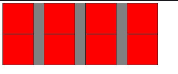
In the example below, the width of the container is 500, the width of the inner blocks is 100.
Let's say I need to build such a structure that there would be 4 blocks in a row and then spread to the next line. At the same time, these 4 blocks should be aligned according to the space-between principle.
I tried to do it through wrappers, create them by 25% and position the element in each of the wrappers, but there is a problem with the need to line up through space-between.
What other options might there be?
I need something like this:

Now I have an idea, given that I'm doing this on vue, which you can just do without flex-wrap, and divide the incoming array into the required number of blocks and display them simply as separate, independent blocks in which there is a space-between. But still, is there some kind of css solution?
Answer the question
In order to leave comments, you need to log in
1. You don't need space-between.
Because the next move turns out that if the number of child blocks is not a multiple of 4, then it looks bad.
2. If the width of the wrapper and child blocks is fixed, then just use
.item:not(:nth-child(4n)) {
  margin-right: calc(100px / 3);
}Now an idea has come up, given that I'm doing this on vue, which you can just do without flex-wrap, and divide the incoming array into the required number of blocks and output them simply as separate, independent blocks in which there is a space-between. But still, is there some kind of css solution?
Didn't find what you were looking for?
Ask your questionAsk a Question
731 491 924 answers to any question