Answer the question
In order to leave comments, you need to log in
How to implement such a framework structure with adaptability?
Hello everyone, friends!
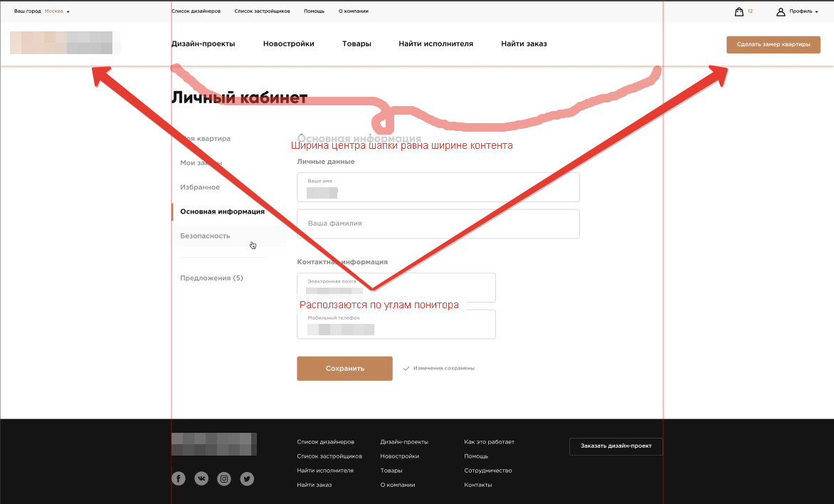
There is this layout: 
The content is aligned in the middle.
The whole problem is in the header: the central part is aligned in the middle, and the right and left parts are scattered on the sides.
The width of the right and left columns are unknown. The central part is equal to the width of the content, let's say 1200px.
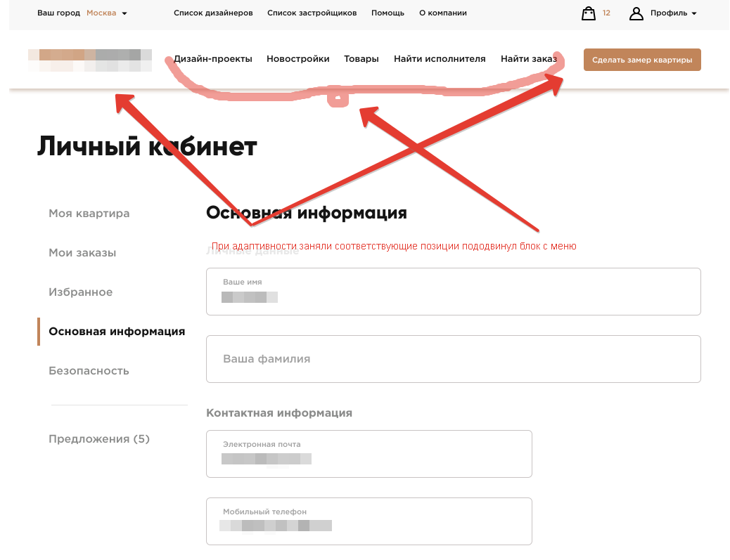
When adaptive, the right and left columns move the central part by the appropriate distance: 
How to do this?
If the central part is given:
max-width: 1200px;
margin: 0 auto;Answer the question
In order to leave comments, you need to log in
Didn't find what you were looking for?
Ask your questionAsk a Question
731 491 924 answers to any question