Answer the question
In order to leave comments, you need to log in
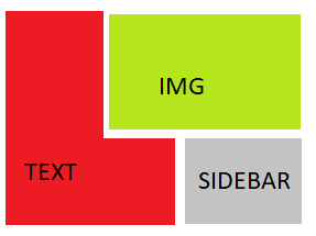
How to implement layout with wrapping?

Can you tell me how to implement this in bootstrap 3? Or maybe there is another elegant way out without a bunch of problems with adaptability?
I made such a disgrace as an example, but it's a shame to dump such a thing on the page.
Answer the question
In order to leave comments, you need to log in
1. Arrange the elements as in the picture, the easiest way is by setting width, float and clear for them. And this is logical, floats are just designed for all kinds of flow around.
2. So that the indents between the picture and the text do not jump, there is an even grid, and the lines in different blocks coincide vertically, it makes sense to firmly bind its (image) height to EM / REM. In general, it is convenient to tie everything to these units, but that's another story.
3. Based on point 2, you need to add media expressions for the image to different screen sizes. Yes, it's redundant work. Yes, it's not chik-chik in production either, but if the little things in design are important, we do it.
4. On small screens, all this will be poorly perceived, so we line up the elements in a column. Width at 100% all over. In my mind, the content is more important than the aside, so we change their order using the flex, flex-direction and order properties.
You will get something like this:
Didn't find what you were looking for?
Ask your questionAsk a Question
731 491 924 answers to any question