Answer the question
In order to leave comments, you need to log in
How to implement 3 rubber blocks with fixed padding?
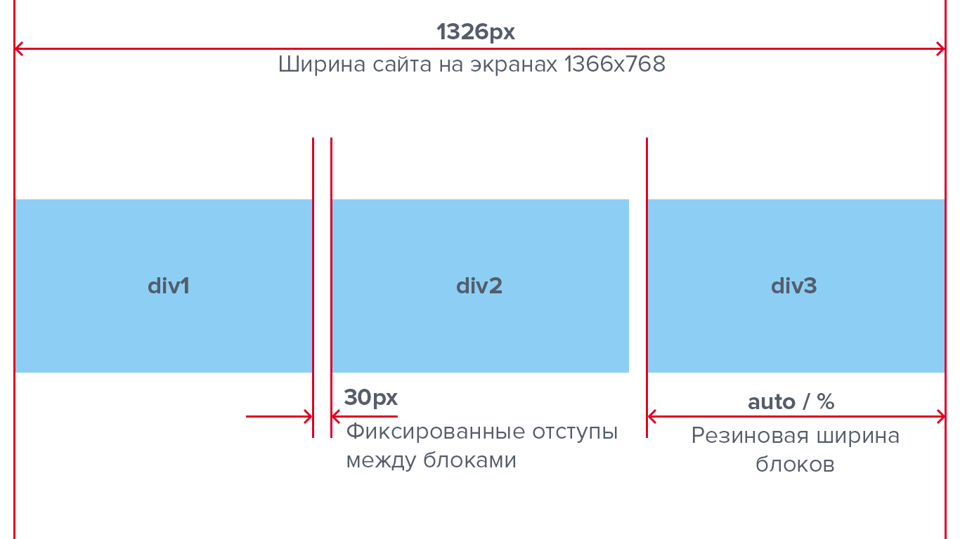
In general, I encountered such a problem when laying out an adaptive site. The website width floats between 320px and 1600px. There are 3 blocks. It is necessary that these blocks occupy the entire provided area and at the same time have the same width (auto) and intervals (30px). When the window size is reduced, the blocks should shrink in width, and the padding should remain unchanged.
Implementation without flexbox.
We need your help, dear forum users! I will be very grateful if you help!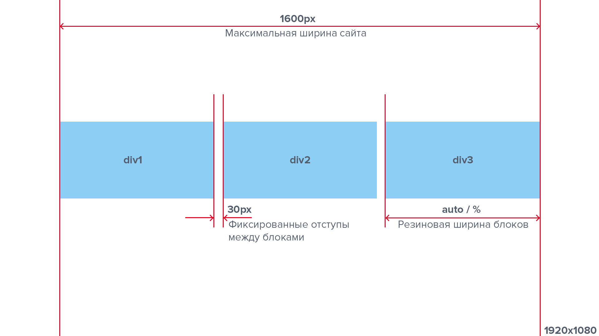
Answer the question
In order to leave comments, you need to log in
.row {
  margin: 0 -15px;
}

.row:after {
  content: "";
  display: table;
  clear: both;
}

.col {
  float: left;
  width: 33.33333%;
  padding: 0 15px;
}<div class="row">
<div class="col">
<div class="your-blue-div">div1</div>
</div>
<div class="col">
<div class="your-blue-div">div2</div>
</div>
<div class="col">
<div class="your-blue-div">div3</div>
</div>
</div>Didn't find what you were looking for?
Ask your questionAsk a Question
731 491 924 answers to any question