Answer the question
In order to leave comments, you need to log in
How to force text not to get out of flex-container redistribution?
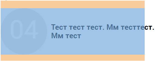
Good time, I ran into a problem: the text goes beyond the flex-container (h3).
Properties: word-wrap, word-break, don't help...
Tried everything I knew but didn't work
I can't figure out why
h3 {
font-size: 25px;
    display: -webkit-box;
    display: -webkit-flex;
    display: -ms-flexbox;
    display: flex;
    -webkit-box-align: center;
    -webkit-align-items: center;
    -ms-flex-align: center;
    align-items: center;
    margin-bottom: 20px;
    word-break: initial;
}
h3::before {
    display: inline-table;
    text-align: center;
    padding-top: 19px;
    -webkit-box-sizing: border-box;
    box-sizing: border-box;
    background-color: #e8e8e8;
    -webkit-border-radius: 50%;
    border-radius: 50%;
    color: #fff;
    font-size: 85px;
    font-weight: 200;
    width: 153px;
    height: 153px;
    margin-right: 13px;
}Answer the question
In order to leave comments, you need to log in
in general, here is an example of what was described above in the comments (a simple abs element)
https://jsfiddle.net/1e43aorq/
Why would you want to use flex in this case? In addition, to clip content that extends beyond the element, you need to use overflow: hidden.
Try to set the width for the parent block, and padding-right can be indented if you want
-webkit-box-flex:
Specifies whether a box can stretch to the empty space of its parent. The default value is 0. This means that the block is not stretchable, its width (height, depends on the orientation of the parent) is equal to the width (height) specified in the styles.
If the -webkit-box-flex property is set to a value other than 0, then the box is stretched in the parent proportionally with adjacent child elements.
If, for example, all child boxes have -webkit-box-flex:1, then they evenly fill the entire space of the parent, having equal sizes.
If one has a value of 1, and the neighboring one has a value of 2, then the first one will take a third of the parent, and the second - two-thirds.
Didn't find what you were looking for?
Ask your questionAsk a Question
731 491 924 answers to any question