Answer the question
In order to leave comments, you need to log in
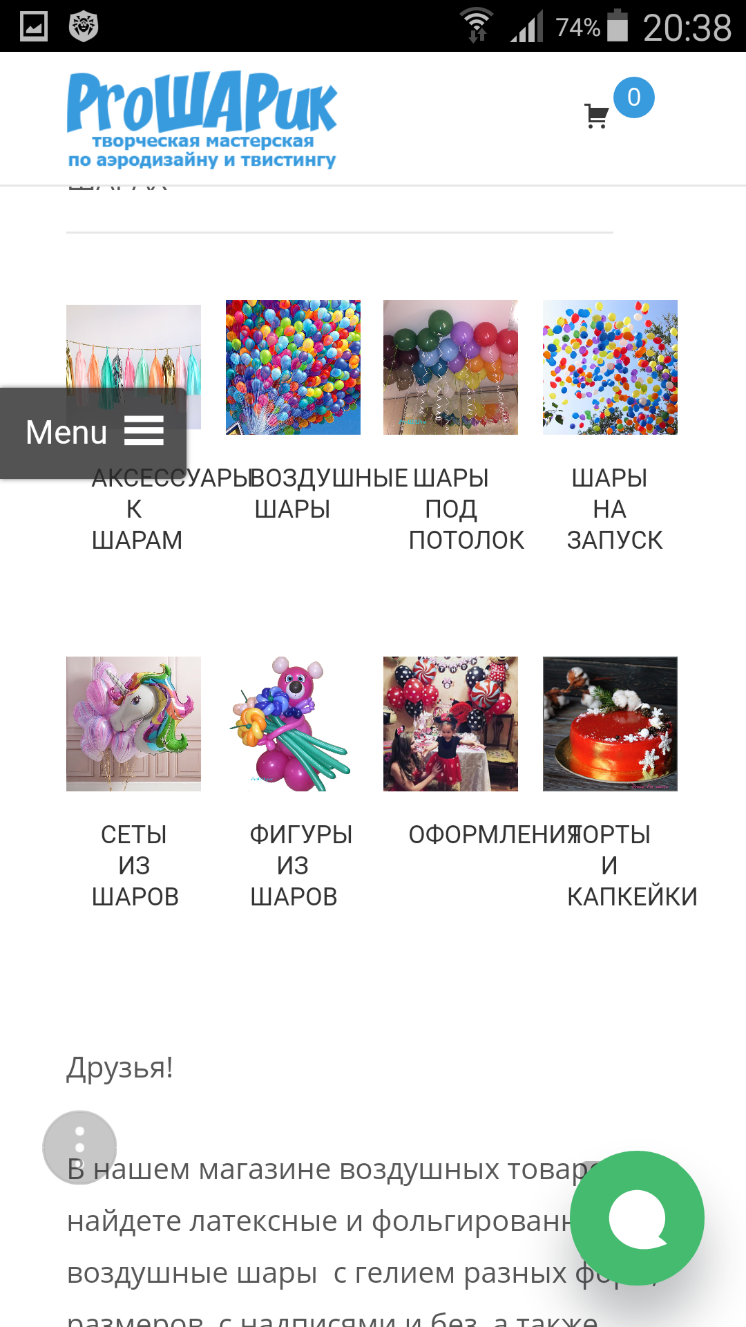
How to fix WooCommerce layout on a mobile device?
Good evening!
The site https://prosharikballoons.ru, CMS Wordpress, i-Craft theme, displayed categories of goods on the main page, it is normal on the desktop, but on a mobile or tablet the text under the categories is displayed crookedly. 
Advise in which direction to dig?
Answer the question
In order to leave comments, you need to log in
If you really hotfix it, then like this:
@media screen and (max-width:480px){
    .woocommerce ul.products li.product, .woocommerce-page ul.products li.product {
        width: 42.5%;
    }
}Learn CSS & WordPress/WooCommerce. Spend money on fine-tuning the topic to mind.
Or use the Storefront theme.
Didn't find what you were looking for?
Ask your questionAsk a Question
731 491 924 answers to any question