Answer the question
In order to leave comments, you need to log in
How to fix poor font rendering in Google Chrome?
Hello.
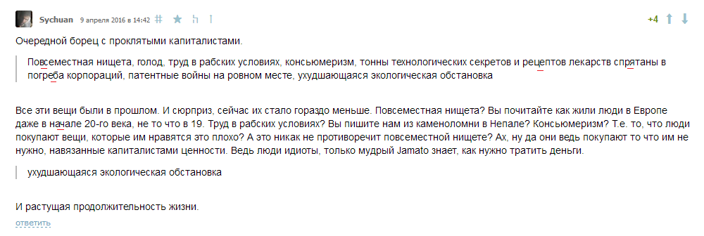
Tell me, please, how can I fix the poor display of fonts in Google Chrome 49.0.2623.112 m (64-bit)?
On the example of Geektimes (underlined in red) - stuck together letters a la ligatures: Click to open in full size.
This is not only in the latest version, but also in several previous ones.
Disabling DirectWrite, as well as other manipulations in the flags with subpixel text smoothing and distance maps for text rendering, do not help.
Tell me how to fix this? There are no forces anymore. 
Answer the question
In order to leave comments, you need to log in
Those who experience problems with fonts (letters run into each other or vice versa a large distance)
can vote on the official bug tracker
https://bugs.chromium.org/p/chromium/issues/detail...
It is necessary to mark an asterisk on the left.
You can also leave a comment that the problem exists.
The more people point out a bug, the sooner it should be fixed.
You only need a google account, no additional registrations.
Now I specially opened Chrome, looked - there are no sticky letters. In general, font rendering is lighter and generally less pleasant than in FF, but I don’t see such obvious defects as in the screenshot.
The browser version is almost the same - at the end 110 instead of 112.
What video card? And then, I remember, for several years I had some kind of obscenity going on with font smoothing on the built-in Intel video core. As soon as I bought the simplest nVidia, the problem disappeared.
Faced a similar problem. Interest for even put a clean Windows 10 on a virtual machine - kerning jumps there too. And this is a problem not only of Opera, but also of any other browser based on the Chromium engine. As a crutch, I found only a script for Stylish which replaces Arial with a font from the list.
Didn't find what you were looking for?
Ask your questionAsk a Question
731 491 924 answers to any question