Answer the question
In order to leave comments, you need to log in
How to fit a large table in a bootstrap container?
I export data from the database to a table on the site
Table in the bootstrap container,
<div class="container">
</div>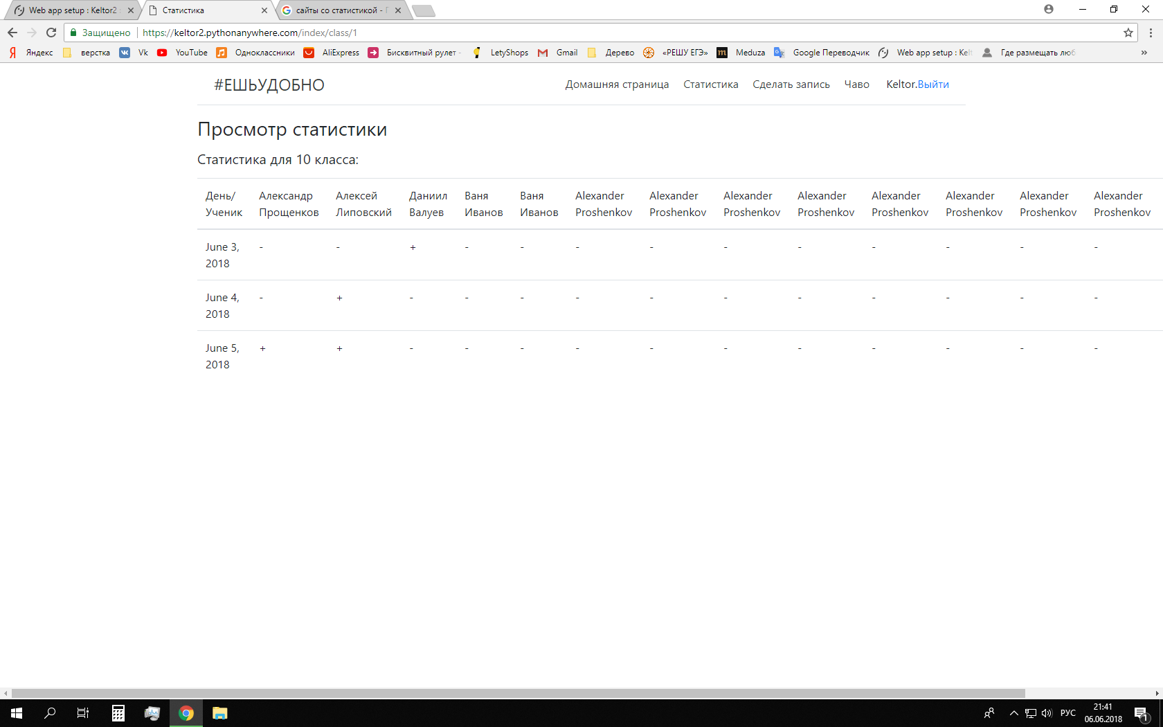
Answer the question
In order to leave comments, you need to log in
.container-fluid
  .table-responsive
table.tableDidn't find what you were looking for?
Ask your questionAsk a Question
731 491 924 answers to any question