Answer the question
In order to leave comments, you need to log in
How to fit a burger button in a header?
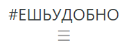
There is a bootstrap header, a menu button at 760px and less than the display width wraps to a new line, how to make it stay together with the logo on the same line?
index:
<div class="container">
<div id="sidebar" class="d-flex flex-column flex-md-row align-items-center p-3 px-md-4 mb-3 bg-white box-shadow border-bottom">
<a class="text-dark" href="{% url 'index' %}"><h4 class="my-0 mr-md-auto font-weight-normal">#ЕШЬУДОБНО</<h4></a></h4>
<button class="hamburger">☰</button>
<button class="cross">☰</button>
<div class="sidebar">
<nav class="my-2 my-md-0 mr-md-3">
<a class="p-2 text-dark" href="{% url 'index' %}">Главная страница</a>
<a class="p-2 text-dark" href="{% url 'class' %}">Статистика</a>
<a class="p-2 text-dark" href="{% url 'writeindex' %}">Сделать запись</a>
<a class="p-2 text-dark" href="{% url 'faq'%}">Чаво</a>
<a class="p-2 text-dark" href="{% url 'account'%}">Аккаунт</a>
<a href="{% url 'login' %}" class="btn btn-outline-primary">Войти</a>
</nav>
</div>
</div>
<div class="menu">
<ul>
<a class="text-dark" href="{% url 'index' %}"><li>Главная страница</li></a>
<a class="text-dark" href="{% url 'class' %}"><li>Статистика</li></a>
<a class="text-dark" href="{% url 'writeindex' %}"><li>Сделать запись</li></a>
<a class="text-dark" href="{% url 'faq'%}"><li>Чаво</li></a>
<a class="text-dark" href="{% url 'account'%}"><li>Аккаунт</li></a>
<a href="{% url 'login' %}" class="btn btn-outline-primary">Войти</a>
</ul>
</div>
</div>body{
-webkit-font-smoothing: antialiased;
-moz-osx-font-smoothing: grayscale;
}
.hamburger{
background:none;
top:0;
right:0;
color:#999;
border:0;
font-size:1.4em;
font-weight:bold;
cursor:pointer;
outline:none;
z-index:10000000000000;
}
.cross{
background:none;
top:0px;
right:0;
padding:0px 15px 0px 15px;
color:#999;
border:0;
font-size:1.4em;
font-weight:bold;
cursor:pointer;
outline:none;
z-index:10000000000000;
}
.menu{z-index:1000000;
width:100%;
padding-left: 5%;
padding-bottom: 5%;
padding-top: 1%;
}
.menu ul {margin: 0;
padding: 0;
list-style-type: none;
list-style-image: none;
}
.menu li {display: block;
padding:5px 0 15px 0;
}
.menu ul li a { text-decoration: none;
margin: 0px;
}
.menu ul a li:hover { color: #666;
text-decoration:underline;
}
.menu a{text-decoration:none;
color:#666;
}
.menu a:hover{text-decoration:none;
color:#666;
}
@media screen and (min-width: 993px){
.hamburger {display: none;}
.cross {display: none;}
.menu {display: none;}
}
@media screen and (max-width: 992px){
.sidebar {display: none;}
}
Answer the question
In order to leave comments, you need to log in
Didn't find what you were looking for?
Ask your questionAsk a Question
731 491 924 answers to any question