Answer the question
In order to leave comments, you need to log in
How to customize the output of comments?
Tell me how to fix it, the whole brain has already broken 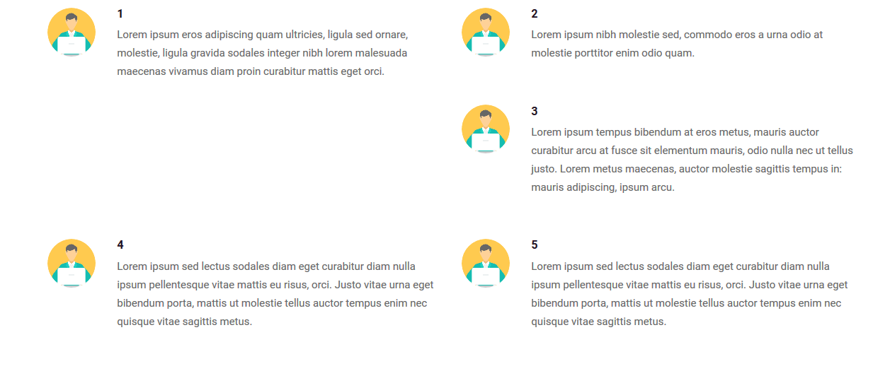
on the screen, you can see that the third comment was displayed under the second, but it should have been under the first, and already the fourth under the second, etc.
<div class="col-md-6">
  <div class="testimonial-section-box">
    <div class="row">
      <div class="col-md-2 col-sm-2 col-xs-2"><img src="{foto}" class="img-responsive img-circle" alt="testimonial1"></div>
      <div class="col-md-10 col-sm-10 col-xs-10">
        <h5 class="client-name">{author}</h5>
        <div class="client-text">{comment}</div>
      </div>
    </div>
  </div>
.testimonial-section-box {
margin-bottom: 40px;
margin-left: -8px;
}
.client-name {
font-weight: bold;
text-transform: uppercase;
margin-bottom: 8px;
}
.client-text {
font-size: 15px;
margin: 0 0 20px;
line-height: 26px;
}
.col-md-6 {
width: 50%;
float: left;
position: relative;
min-height: 1px;
padding-right: 15px;
padding-left: 15px;
}
.row {
margin-right: -15px;
margin-left: -15px;
}Answer the question
In order to leave comments, you need to log in
The problem is that for .col-md-6 you have a float.
And the third comment is thrown to the right, because the left one is taller.
Judging by the classes, you are using a bootstrap, if a later version that uses flexes, then the float is not needed and the width, respectively, too.
Or then wrap every two comments in .row and clear the stream with clearfix. It's really strange that you still have floats...
In b3, you can use div.clearfix with an additional visibility class in md.
You can also wrap every 2 col-md-6 in .row.
Didn't find what you were looking for?
Ask your questionAsk a Question
731 491 924 answers to any question