Answer the question
In order to leave comments, you need to log in
How to correctly measure the distance from a font to a font/block during layout? Is there a pattern?
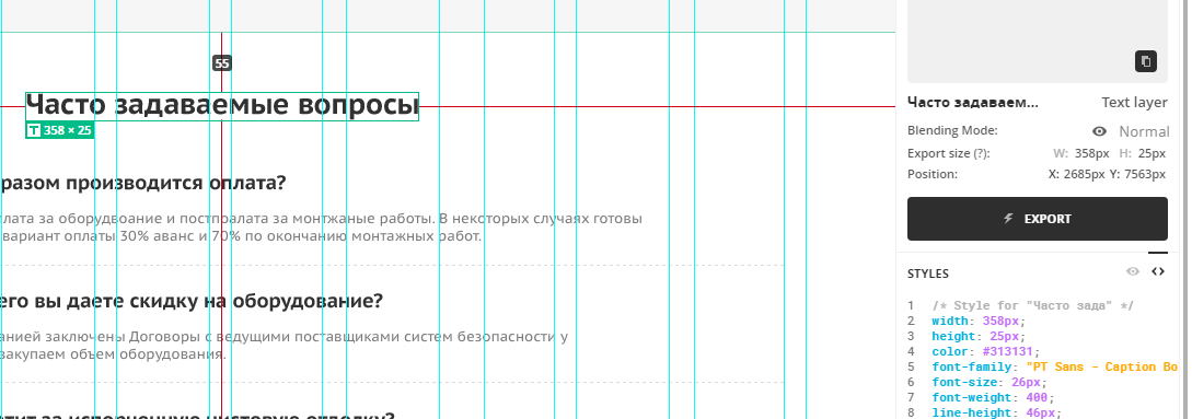
Hello. A question. Are there clear rules by which the layout can measure the exact distance from the font to the font / block? When working with fonts, you constantly have to adjust the difference in distances by eye, and, frankly, this is frankly annoying, it takes a lot of time. In Photoshop / Avocode, font sizes and line heights are prescribed, they have always been taught to subtract the first from the second, divide by two, and that seems to be the difference that needs to be taken into account, but in practice it still gives an error.
Example. 
The avocode shows padding-top: 55px.
font-size: 26px;
line-height: 46px;
In theory, the padding should be calculated like this: 55 - (46-26) / 2 = 45px.
This results in padding-top: 42px if adjusted to fit the layout.
Is there a more accurate way to measure distances?
Answer the question
In order to leave comments, you need to log in
I am a designer, not a typesetter, but I am aware of the circus with gypsies in the indentation of fonts. Unfortunately, wrapping text in a frame differs not only between a graphical editor and a browser, but also between different graphical editors...
Oh, what a pain in the butt :( Personally, I measure from the baseline. And I recommend that all layout designers do the same. I have a certain grid in my layout (I used to use a regular grid, now I use horizontal rulers) + a pixel grid - you turn them on in the layout (if, of course, they are laid there ...) and you can calculate the distances by eye.
In Photoshop / Avocode, font sizes and line heights are prescribed, they always taught to subtract the first from the second, divide by two, and that's the difference that needs to be taken into account, but in practice it still gives an error.
Didn't find what you were looking for?
Ask your questionAsk a Question
731 491 924 answers to any question